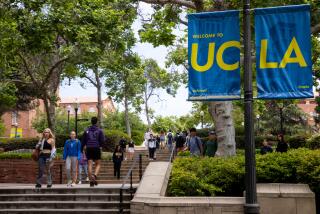
New UC logo on suspension after much well-deserved criticism
When California Lt. Gov. Gavin Newsom said “Ugh!” on Tuesday, the months-long rollout of a brand-spanking new University of California logo officially became a fiasco. Today the school announced it would suspend its use.
Some students had been up in arms about the redesign for a while, but then students are supposed to complain about school administration and its inevitable idiocy. But when a progressive state politician -- and UC regent -- joins more than 54,000 petitioners and a torrent of brickbats in social media thrown at the design, attention will be paid.
So, was the new logo really that bad? I’d say: Ugh.
The new design streamlined elements of the old. (A short video tracks the evolution.) The dimpled blue profile of an open book sags into a deep U, with a swiped yellow C resting at the bottom of the curve. Its flat, sleek style, readable from across the room, implies hip contemporary branding, which the university wanted, while also appearing frankly corporate, which it didn’t.
The old mark is cheerfully corny. A star, a book, a slogan (“Let there be light”) on an ornamental ribbon -- the seal looks like scores of other university logos born in the days when hand presses stamped them on diplomas and into books. This one will continue to be printed on the faux-sheepskins handed out to graduates, as well as other official UC documents.
The old design evokes the international Arts and Crafts movement, circa 1900, which merged an anti-industrial philosophy of social and economic reform with folk-style individual craftsmanship. Today its superannuated stodginess is fundamental to the visual quality that has grown up around it over decades like, well, ivy: Age symbolizes wisdom, even when things don’t always work out that way, and what should a university logo be but a symbol of smarts?
“The [original] seal signifies the prestige and tradition of the university itself, and is a treasured part of the UC identity,” said Jason Simon, marketing communications director at UC’s office of the president, in a recent online posting that assumed full defensive crouch. “There has never been any plan to replace it with the monogram.”
Simon was among the UC spokesmen who had rushed to point out that the new mark wouldn’t supplant the old, but would merely join it for use on digital websites and system-wide merchandise. Ugh. Trendy-and-traditional makes for a clash even noisier than Bruin-and-Trojan. The suspension restores the peace, pepper spray not required.
christopher.knight@latimes.com
MORE
INTERACTIVE: Christopher Hawthorne’s On the Boulevards
TIMELINE: John Cage’s Los Angeles
PHOTOS: Arts and culture in pictures
More to Read
The biggest entertainment stories
Get our big stories about Hollywood, film, television, music, arts, culture and more right in your inbox as soon as they publish.
You may occasionally receive promotional content from the Los Angeles Times.


