Review: The restored Met Breuer (formerly the Whitney) has a new energy as well as a lived-in look
File this one under the wisdom of letting an old dog do old tricks.
In restoring Marcel Breuer’s 1966 Whitney Museum building at Madison Avenue and 75th Street as a satellite venue — and a way to shore up its modern- and contemporary-art bona fides — the Metropolitan Museum of Art has figured out how and where to leave well enough alone.
Sure, not everybody is happy that the museum, in preparing to reopen a building it now calls the Met Breuer, added a dash of digital-age glitz in the form of a matte-black video board, 6 feet high and 23 feet long, to the back wall of the lobby. On the whole, though, the Met’s collaboration with New York firm Beyer Blinder Belle has been painstaking in its restraint.
More to the point, it has managed what every prominent restoration aims to do but few actually accomplish: It has given museum-goers too young to experience the controversial building when it was new a clear sense of its original strength.
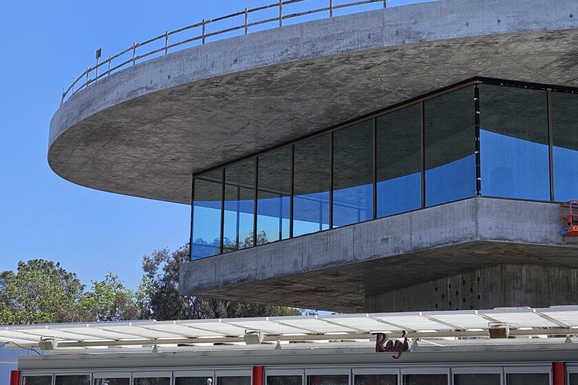
Curators and artists have grumbled about its eccentricities over the years, but there is a rare architectural power in Breuer’s top-heavy and nearly windowless museum, which takes the form of an upside-down ziggurat, growing wider as it rises, and is faced in panels of gray granite. For me it ranks with the Louisiana Museum north of Copenhagen by Jørgen Bo and Vilhelm Wohlert (1958), the Oakland Museum by Kevin Roche and John Dinkeloo (1969), Louis Kahn’s Kimbell Art Museum in Fort Worth (1972) and Renzo Piano’s Menil Collection in Houston (1987) as one of the finest museum buildings of the second half of the 20th century.
FULL COVERAGE: Spring 2016 arts preview | Exhibits | Theater | Dance | Pop music | Books
Like many fans of Breuer (pronounced BROY-er), I was disappointed when the Whitney decamped for a new Piano-designed headquarters along the High Line, leaving the old building in limbo. Though I like the ungainliness of Piano’s Whitney — its willingness to look unresolved and unpretty — it doesn’t come close to matching the older museum as a work of architecture or an expression of its era.
Thanks to what the Met and Beyer Blinder Belle have done to the place, the combination of brashness and obsessive attention to detail central to Breuer’s design has snapped sharply back into focus.
I’ve even gained some sympathy for the Whitney’s decision to move, since in revisiting the 1966 building I was reminded not just how small it is (with total exhibition space of just 29,000 square feet, compared with 50,000 at the new Broad in Los Angeles) but also how unyielding its aesthetic personality can be.
This is a piece of architecture that never lets up, that presents its ideas in unusually dense, compacted form. The same muscularity that animates its facade reappears in the board-formed and bush-hammered concrete walls, the cast-terrazzo treads of the main staircase and the bronze elevator doors. Breuer chose what he called “close to Earth materials,” but everywhere their roughness is countered by an unusually fine sense of proportion and detailing.
That balance had been knocked askew a bit over the years as the building was updated and as it aged. In that sense the present outcome, though not permanent (the Met has signed an eight-year lease, with an option to renew for another five and half), is nearly ideal.
The Met has the advantage of sending a limited, carefully chosen batch of artworks on the half-mile trip to Madison Avenue. (Two major shows were installed for the reopening: “Unfinished,” a collection of incomplete works from a range of eras, and a retrospective of the late Indian artist Nasreen Mohamedi.)
The Breuer building, for its part, is able to breathe more easily, relieved of over-packed galleries and tinkering by curators looking — as Whitney staffers did for decades — to squeeze just a few more square feet of exhibition space from its five public floors (six if you count the basement, where a restaurant will open this summer).
This new chapter in the building’s history is all the more encouraging when you consider the various ways its architectural integrity was nearly sacrificed during its middle-age years, as the Whitney pursued and then abandoned a series of expansion plans. Michael Graves, Rem Koolhaas and finally Piano were enlisted to take on the nearly impossible task of giving the museum more space without undermining the Breuer building, which gains so much of its personality from its aloofness, the way it stands apart from the brownstones next door and, thanks to its moat-like sunken garden along Madison, from the sidewalk and the life of the street.
That separation was not something Breuer pursued solely for reasons of architectural drama. As an expression of philosophical as much as aesthetic principles the building was meant to be, in nearly every way, something apart: a ship, an island, a castle-like outpost ready to brush off predictable slings and arrows. Unapologetically, Breuer wanted to carve out a space distinct from the conventional architecture of the period.
In that interest he was hardly alone. Can we pause here to note the remarkably vital traffic among the worlds of American art, architecture and urbanism, the quality of fresh thinking, in the period when the Whitney was designed and built?
The stretch between 1963 and 1966 brought us, along with the Whitney and plans for Roche and Dinkeloo’s Ford Foundation, Ed Ruscha’s photography book “Every Building on the Sunset Strip”; Bertrand Goldberg’s scalloped-concrete Marina City towers in Chicago; Frank Gehry’s deadpan-plain Danziger Studio on Melrose Avenue in Los Angeles, its stucco walls as carefully, meaningfully wrought as the Whitney’s concrete and granite ones; the first of the groundbreaking collaborations between Robert Venturi and Denise Scott Brown; and the great and still underappreciated Charles Moore essay on architecture in California, “You Have to Pay for the Public Life.” Kahn was also in his prime.
What connected those figures was impatience with the rigid rule-making of International Style modernism alongside an emerging interest in history and rich materiality. Breuer, who said he wanted the Whitney above all to have “identity and weight,” leaned on historical precedents with less irony and humor than did, say, Moore or Venturi and Scott Brown; but in all of that work there is a desire to reject the clean-slate thinking of modernism, the suffocating obligation to produce something relentlessly new and forward-looking every time out.
The Whitney, packed with references to organic, indigenous and monumental architecture, is among the most direct and uncompromising products of that period of shifting allegiances.
Breuer was a Hungarian-born émigré, a product and then a leader of the Bauhaus, a protege of Walter Gropius and a designer of chairs as well as houses, office blocks and embassies. He was in his early 60s and at the height of his architectural powers when he took on the Whitney job. What he produced was something less proto-postmodern or even fully Brutalist than memorably primitive and obsessively consistent as a total work of art.
One key to the restoration’s success was a focus, as the Beyer Blinder Belle architects put it, on a clear distinction between patina and damage. Cracked bluestone panels were replaced and holes in the walls (where shelving was added over the years) invisibly filled in. In other parts of the building, where many thousands of hands have worn down the edges of handrails or concrete corners, signs of use and aging were allowed to remain.
The lobby has been de-cluttered, with Met signage added in limited doses and, overhead, bulbs in Breuer’s grid of dome lights swapped out for dimmable LEDs. The galleries look much the same, with parquet floors on the second level and bluestone pavers from the lobby reappearing on three, four and five.
Unlike the 2008 restoration by Charles Gwathmey of Paul Rudolph’s Art and Architecture building at Yale, which tried to make a tough and brilliantly difficult building sleek, bright and (ugh) user-friendly, the goal here was never to soften the old Whitney or give it an of-the-moment color scheme. It helped that the Met wanted to start using the Breuer building quickly and to keep the budget for the restoration (which it hasn’t disclosed) lean, two goals that favored a generally light touch.
The result is a museum that has a new energy and architectural clarity but at the same time seems lived in and well loved.
One of the misconceptions of the Whitney’s history on this corner is that the Breuer building was unpopular from the start. In fact, many of its problems stemmed from overuse.
Whitney director Thomas Armstrong said in 1978 that he believed the museum worked ideally for about 1,000 daily visitors, though by that year it was straining under the presence of as many as 5,000 on its busiest days. People flocked to it.
Now a new generation of New Yorkers, art fans and architecture buffs — a group that until now has known Breuer’s building as much for its flaws and stubborn resistance to expansion as the power of its ideas — has reason to do the same.
christopher.hawthorne@latimes.com
More to Read
The biggest entertainment stories
Get our big stories about Hollywood, film, television, music, arts, culture and more right in your inbox as soon as they publish.
You may occasionally receive promotional content from the Los Angeles Times.
