FAQ & About
Contents
- What is value-added analysis?
- Do value-added scores tell you everything you need to know about a teacher or school?
- Why did you decide to publish teachers’ scores?
- How has the database changed?
- How do I read the new teacher ratings?
- Why was the graphic changed?
- Why are teachers grouped into categories?
- Why do the five categories appear to be different sizes?
- Why are there so many more teachers in the database?
- Why has an individual teacher’s rating changed?
- What factors did The Times consider in its value-added analysis?
- Does this mean the previous ratings were wrong?
- If the district is now producing value-added ratings, why does The Times need to?
- What is the difference between the district’s approach and that of The Times?
- What are the limitations of value-added?
- How much difference is there between the most and least effective teachers and schools?
- How accurate are teacher ratings?
- How accurate are school ratings?
- What types of errors cannot be accounted for?
- Are third-grade teachers hurt by the fact that test scores tend to drop in third grade?
- How does value-added analysis differ from the state’s Academic Performance Index?
- How much does the methodology affect ratings?
- How is a teacher's grade level determined?
- Why does the database contain only third-through fifth-grade teachers in L.A.?
- Does this tell me anything about how L.A. compares with other districts?
- Where did the data come from and was it checked for inaccuracies?
- Did The Times use any private information in preparing these ratings?
- Where can I learn more?
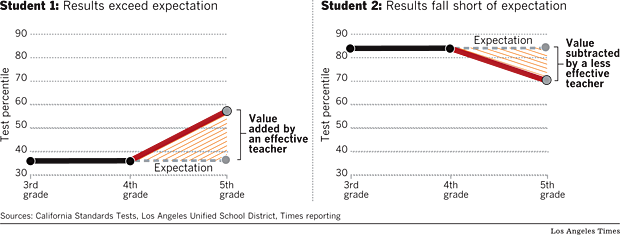
What is value-added analysis?(Back to top)
Value-added is a statistical approach that estimates a teacher's effectiveness at raising student performance on standardized tests. In essence, it projects a child's future performance by using past scores -- in this case, on math and English tests. That projection is then compared to the student's actual results. The difference is the "value" that the teacher added or subtracted. Comparing each student to him or herself in the past largely controls for differences in students' backgrounds.
Do value-added scores tell you everything you need to know about a teacher or school?(Back to top)
Not at all. Even many advocates of the method say it should count for no more than half of a teacher's overall evaluation. Other factors might include classroom observations, the quality of students' classroom work and instructors' abilities in subjects other than English and math. Similarly, parents looking for a school for their child may also want to consider factors such as the school's API score, course and extracurricular offerings and their own impressions of the teachers and campus.
Why did you decide to publish teachers' scores?(Back to top)
Research has repeatedly found that teachers are the single most important school-related factor in a child's education. Until now, parents have had no objective information about the effectiveness of their child's teacher.
How has the database changed?(Back to top)
First, we rated about 11,500 teachers, nearly doubling the size of the database. With few exceptions, it now includes a rating in English and math for every Los Angeles teacher who taught third, fourth or fifth grade from 2004-05 through 2009-10. (A few teachers have been excluded because the records suggested that their students or schools were substantially different from the norm or that there were data errors or omissions.) We've also revamped the way we display teacher ratings. In addition, we made changes in the statistical model to further reduce the chance that factors other than a teacher's effectiveness would influence the rating.
How do I read the new teacher ratings?(Back to top)
The bar along the bottom represents the range of teacher ratings, from least effective on the left to most effective on the right. The red line shows the best estimate for the teacher. All statistics have a degree of uncertainty. The shading represents the range in which each teacher's estimate falls with 90% certainty. The certainty is greatest near the red line and declines as the shading fades. The beige background shows the distribution of the other 11,500 teachers in the analysis, with most in the middle.


Why was the graphic changed?(Back to top)
The new graphic includes more information: how much certainty there is in a given teacher's score and each teacher's position relative to all other teachers in the analysis. It also more clearly shows the degree to which teachers who are extremely effective or ineffective differ from the vast majority of teachers in the middle. A few teachers were so much higher or lower than average that their ratings extended out of view. Drag the graph to see the remainder of the distribution.
For clarity of display, the math and English graphics are the same size. Because English ratings vary less, the distribution would appear narrower and steeper if shown on the same scale as math.
Why are teachers grouped into categories?(Back to top)
We think the five-category rating system is useful. This practice is followed by many school districts that use value-added calculations. Although the confidence intervals of some teachers span more than one category, the teacher is most likely to fall within the category indicated by the diamond.
Why do the five categories appear to be different sizes? (Back to top)
As before, each category contains roughly the same number of teachers -- one-fifth of the total. The earlier graphic displayed teacher ratings using a percentile scale. Although familiar to most people, percentile rankings do not show how much more or less effective one teacher is than another. They tend to exaggerate the difference between teachers who are near average and minimize the difference between the least effective and most effective teachers. The new graphic is scaled to more precisely show the distance between each teacher's rating and the average.
Why are there so many more teachers in the database?(Back to top)
In our initial database, we only published ratings for teachers who had at least 60 students with English and math scores in two consecutive years. We set that standard because it limited the database to teachers whose ratings came with a high degree of confidence. In the new database we show the actual degree of confidence for each rating, providing additional transparency and allowing us to display data for thousands of additional teachers. For teachers with relatively few students, the ratings have less certainty. In extreme cases, the shaded area on the graphic -- what statisticians refer to as the confidence interval -- can cover more than a third of the scale.
Why has an individual teacher’s rating changed?(Back to top)
There are several possible explanations. Teacher performance varies from year to year. The Times dropped student scores from the 2002-2003 school year and added the latest scores from 2009-2010.
The addition of more than 5,000 teachers could also change an individual's relative position. Finally, changes in our statistical methodology could cause some ratings to change.
What factors did The Times consider in its value-added analysis?(Back to top)
In addition to students' past test scores, value-added models can adjust for a variety of factors to measure a teacher's effect on students. In our first version, we also took into account gender, poverty, number of years in the district and whether a student was classified as an English-language learner. Our new model includes further adjustments for the educational attainment of the student's parents, class size, student mobility and five levels of English proficiency. It also makes an adjustment for what are called peer effects, the collective characteristics of a class.
Some other value-added models make adjustments for an individual student’s race or ethnicity and special education status. The Times could not do that because L.A. Unified withheld that information in the interest of student confidentiality. The Times excluded test scores from special education students who were not assigned to a grade.
In lieu of individual race designations, The Times used grade-level data provided by the state.
Does this mean the previous ratings were wrong?(Back to top)
No. Think of this as version 2.0. In general the two methods produced very similar results. In the eight months since we published our first ratings, we have continued to think about how best to produce and present the data. We have also considered the opinions of experts, educators and policymakers. All value-added models involve a series of judgment calls on which there is no universal agreement. What we present here reflects our best judgments, which will no doubt continue to evolve with time.
If the district is now producing value-added ratings, why does The Times need to?(Back to top)
After The Times produced its initial ratings in August, the district began to prepare its own teacher and school-wide value-added scores. School-wide scores were released in April and individual scores are slated to be released before the end of the school year. The district has released the school scores publicly but is keeping teacher scores between the teacher and district officials. The Times believes the teacher ratings are of great interest to parents and others and should be available to the wider public.
What is the difference between the district’s approach and that of The Times?(Back to top)
The analyses use a similar approach, though the district and The Times controlled for slightly different variables. The district bases its ratings on up to three years of data, while The Times uses up to seven years. In addition, the district will rate 3rd through 9th grade teachers, whereas The Times rated 3rd through 5th grade teachers.
Finally, the district and The Times displayed their results in a significantly different way.
What are the limitations of value-added?(Back to top)
It is based on standardized tests, which many teachers and others consider a flawed and narrow gauge of learning. In California, the tests are not given to students in kindergarten or first grade, so scores are not available for those teachers. Scholars continue to debate the reliability of various statistical models used for estimating value-added, and estimates may be influenced by non-random assignment of students, students' mobility during the school year and other factors.
How much difference is there between the most and least effective teachers and schools?(Back to top)
Teacher effectiveness varies widely, but more in math than English.
In our original report, The Times calculated average student gains or losses within the five teacher effectiveness groups. For teachers whose ratings placed them near a boundary between two groups, that average would have appeared too high or too low. Here are the expected gains or losses of students, in percentile points, for a hypothetical teacher at the boundary line between each group:
| Effectiveness Categories | Math | English |
|---|---|---|
| Least effective/less effective | -7.2 | -4.0 |
| Less effective/average | -2.2 | -1.5 |
| Average/more effective | 1.7 | 0.8 |
| More effective/most effective | 6.9 | 3.7 |
On average teachers in the most effective category raise their students' scores by more than 11 percentile points in math and 6 percentile points in English.
Schools vary less than teachers:
| Effectiveness Categories | Math | English |
|---|---|---|
| Least effective/less effective | -2.2 | -1.0 |
| Less effective/average | -0.83 | -0.3 |
| Average/more effective | 0.5 | 0.2 |
| More effective/most effective | 2.3 | 0.9 |
How accurate are teachers' ratings?(Back to top)
Value-added scores are estimates, not precise measures, and readers should not place too much emphasis on small differences among teachers. As a technical matter, both sampling error and measurement error contribute to the variability of the estimated teacher effects. In general, the potential for error is smaller at the high and low end of the scale and wider in the middle. Put another way, the scores are most accurate for the most effective and least effective teachers and somewhat less so for teachers whose ratings are closer to average.
How accurate are the school ratings?(Back to top)
School ratings have a smaller potential for error because they are based on the scores of more students. However, as with teachers, scores in the middle are less accurate than scores at the extremes.
What types of errors cannot be accounted for?(Back to top)
Because of limitations of our data, The Times could not adjust for every circumstance. Some elementary teachers share their students or switch classes for specialized instruction. In a team-teaching situation, in which one teacher specializes in math and the other English, each would receive a rating in one subject based on the performance of the other teacher's students. Also, occasionally teachers change schools or go on leave during a school year. For those teachers, our ratings may reflect the effects of other, unknown, teachers. We included scores for charter schools when they were available, but many charter schools reported their scores directly to the state rather than to the district.
Are third-grade teachers hurt by the fact that test scores tend to drop in third grade?(Back to top)
No. By first ranking teachers relative to their grade-level peers, the approach controls for grade-level differences in the state test. Although third-graders tend to score lower on California Standards Tests compared with second- and fourth-graders statewide, this does not result in a disadvantage for third-grade teachers.
How does value-added analysis differ from the state's Academic Performance Index?(Back to top)
Value-added measures the academic growth of students from year to year by measuring how much each student has improved over his or her past performance. The API gauges how advanced students at a school are in a number of fundamental subjects.
The API of each school, unlike value-added measurement, is highly correlated with students' socioeconomic status. Experts say both gauges are important and tell parents different things about a school.
How much does the methodology affect ratings?(Back to top)
None of these adjustments makes a very large difference for the majority of teachers. Teachers who have classes with a high percentage of English-language learners or children of college graduates are the ones who are most likely to see an effect on their score.
How is a teacher's grade level determined?(Back to top)
The grade level of a teacher was taken from the annual state test. Some teachers teach combination classes; others teach students at different grade levels. Unusual results may reflect errors in the data reported by L.A. Unified. The Times did not change any results.
Why does the database contain only third-through fifth-grade teachers in L.A.?(Back to top)
It was a first step. In coming months, The Times plans to publish similar ratings for the district's math and English teachers in higher grades. Statewide scores and scores for other school districts are not currently available.
Does this tell me anything about how L.A. compares to other districts?(Back to top)
No. The approach allows for relative comparisons across the district but is not an absolute measure of performance. It does not indicate, for example, the quality of instruction of the average district teacher.
Where did the data come from and was it checked for inaccuracies?(Back to top)
The data were obtained through the California Public Records Act from the Los Angeles Unified School District. The Times sought comment from teachers about the information pertaining to them, and looked for inconsistencies between raw test scores and the findings. Nevertheless, any errors in the district's underlying data could have led to errors in The Times' analysis.
Did The Times use any private information in preparing these ratings?(Back to top)
No. The information was obtained from Los Angeles Unified officials under the California Public Records Act. The Times did not obtain the names of any students, which are private.
Where can I learn more?(Back to top)
The Times has posted a series of articles and more information about the method at Grading the Teachers. You can also read Buddin's technical paper or view our value-added resources page.
Footnotes
What is a distribution?
Like human height, the effectiveness of teachers falls into a distinct pattern that is close to what is commonly known as the bell curve. A distribution describes the number of teachers at any point on this curve and their distance from average. So, as our graphic shows, it is high in the center and low at the edges. Usually distributions are shown as gently curving lines. We show the exact number of teachers at every point on our scale. Though teachers' score are calculated to small decimals, of necessity we have grouped them into 600 points, the number of pixels in our graphic.
What is a confidence interval?
Because of the inherent error in compiling test scores, each rating is actually an estimate, represented by our vertical red line. The estimate is the teacher’s most likely position on the distribution. But there is some possibility that the teacher’s actual position is to the right or left of the estimate. The confidence interval represents the range of possible values in which there is a measurable probability that the actual position falls. We use a 90% confidence interval, meaning there is at least a 5% chance that any teacher’s score is actually lower than the low end of our band and a 5% chance that it is actually higher than the high end. Thus we have shaded the band from 100% on either side of the estimate to 5% at either end.
How do the characteristics of a classroom affect a teacher's rating?
Our initial analysis made adjustments to individual student scores based on their status as English-language learners. Our new database also adjusts for the educational level of each student's parents. However, student performance can also be influenced by the collective characteristics of a class. Consequently, we’ve made a further adjustment for the whole class, taking into account the percentage of English-language learners and the average educational level of its students as well as race. Because the district did not provide us the race of individual students, we adjusted for race at the grade level.
Why is there uncertainty in value-added ratings?
There are numerous sources of potential error and variation. Among them are mistakes in the data provided to The Times, errors in the standardized testing itself and random error caused by differences in the students teachers receive each year. The effects of those errors are more pronounced for teachers who have had only a few students. The more students, the more any variation from student to student and class to class would balance out.
What records were deleted?
We did not count students who were in classes of 10 or fewer or in schools of 100 or fewer. We also excluded about 5,000 students classified by the district as special education without a grade level. We dropped a few hundred records that failed to associate a teacher with a school or showed a teacher at two schools in the same year. Finally, we eliminated a small number of students who took only the English or only the math test but not the other.
|
|
 Delicious
|
 Digg
Digg
|
 Facebook
|
 Twitter
|