Design, Bitches’ colorful aesthetic is all over the map
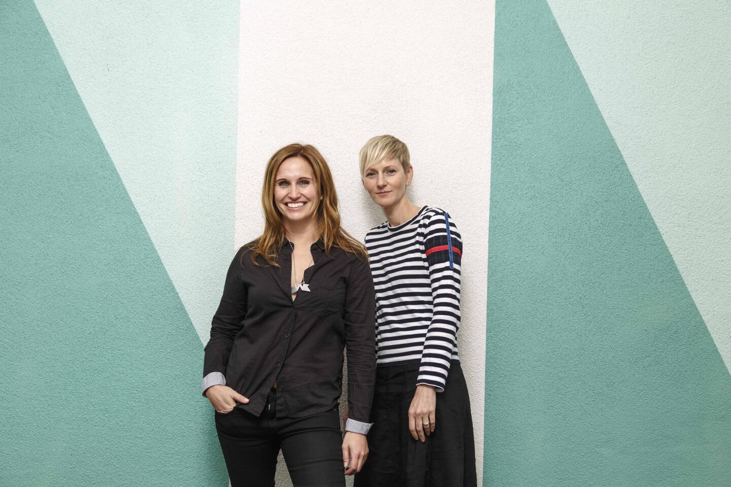

Don’t tell architects Rebecca Rudolph and Catherine Johnson that their spaces are minimalist. And don’t even think about using the phrase “urban chic.” The two Los Angeles women behind Design, Bitches, the firm that designed Superba Snack Bar and Superba Food + Bread in Venice, the Coolhaus brick-and-mortar ice cream stores, Oinkster on Vine and the Springs in downtown L.A., are beyond one-off descriptions, and they know it.
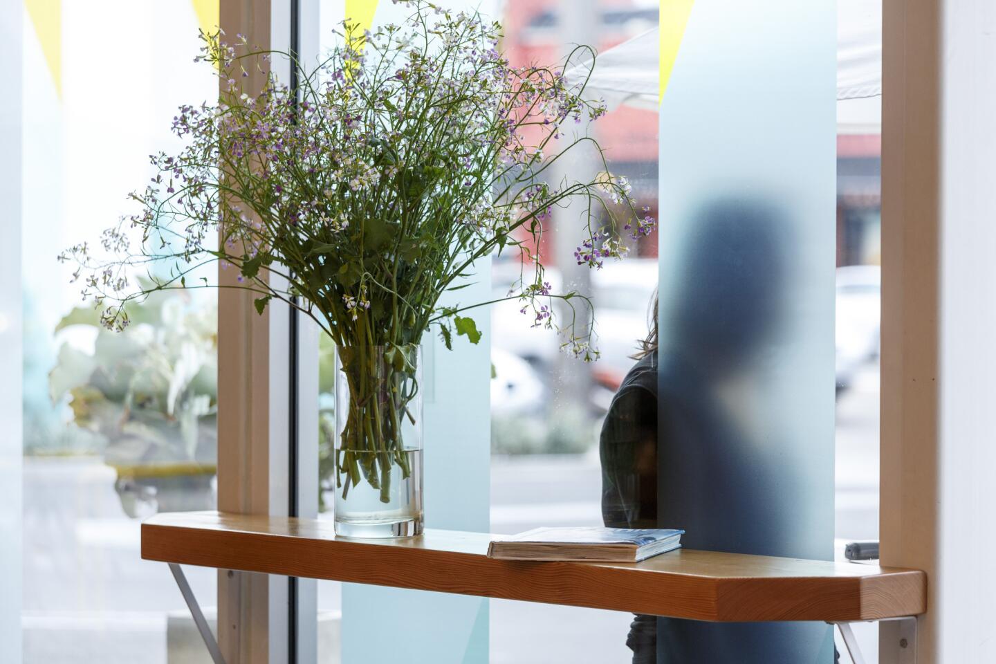
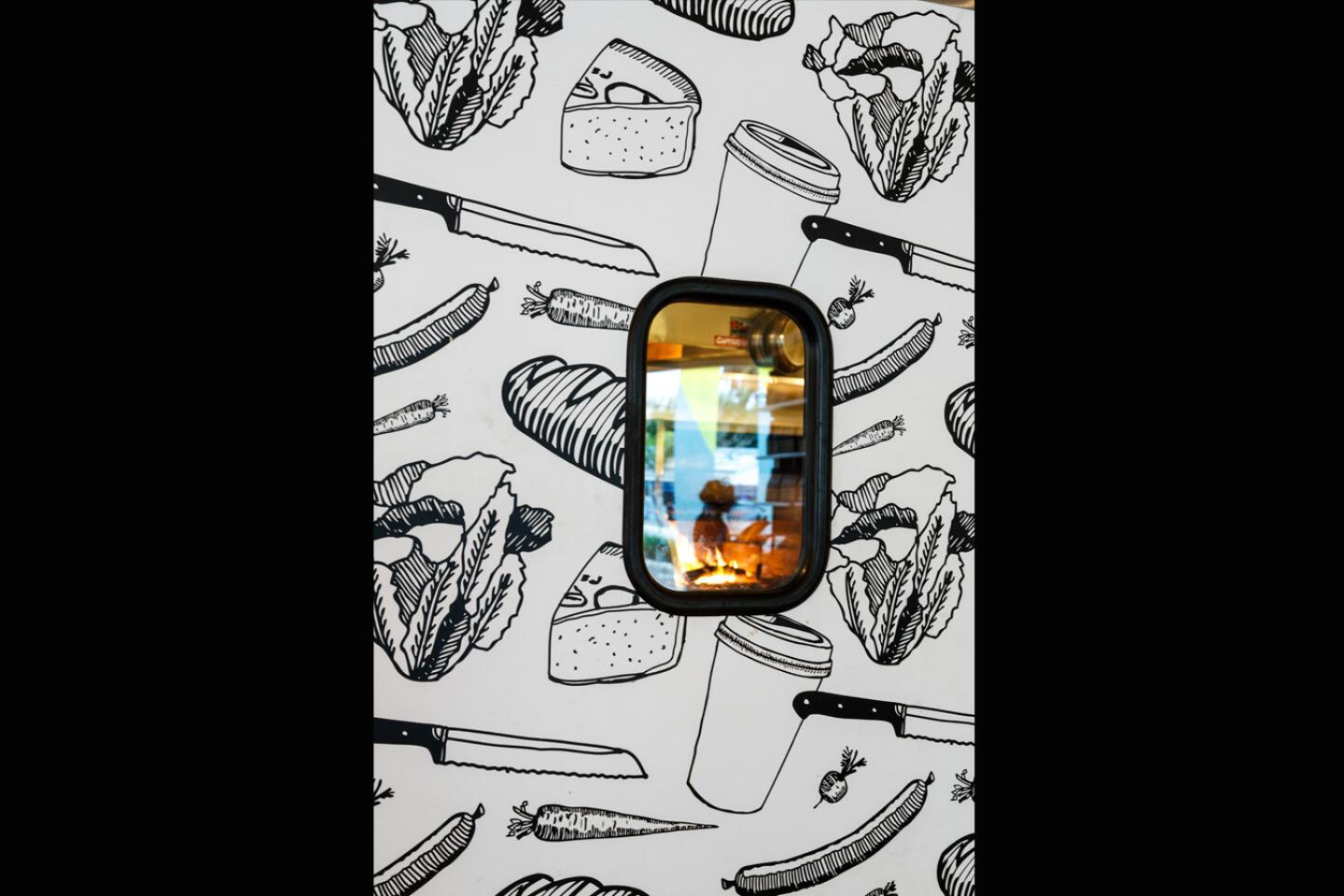
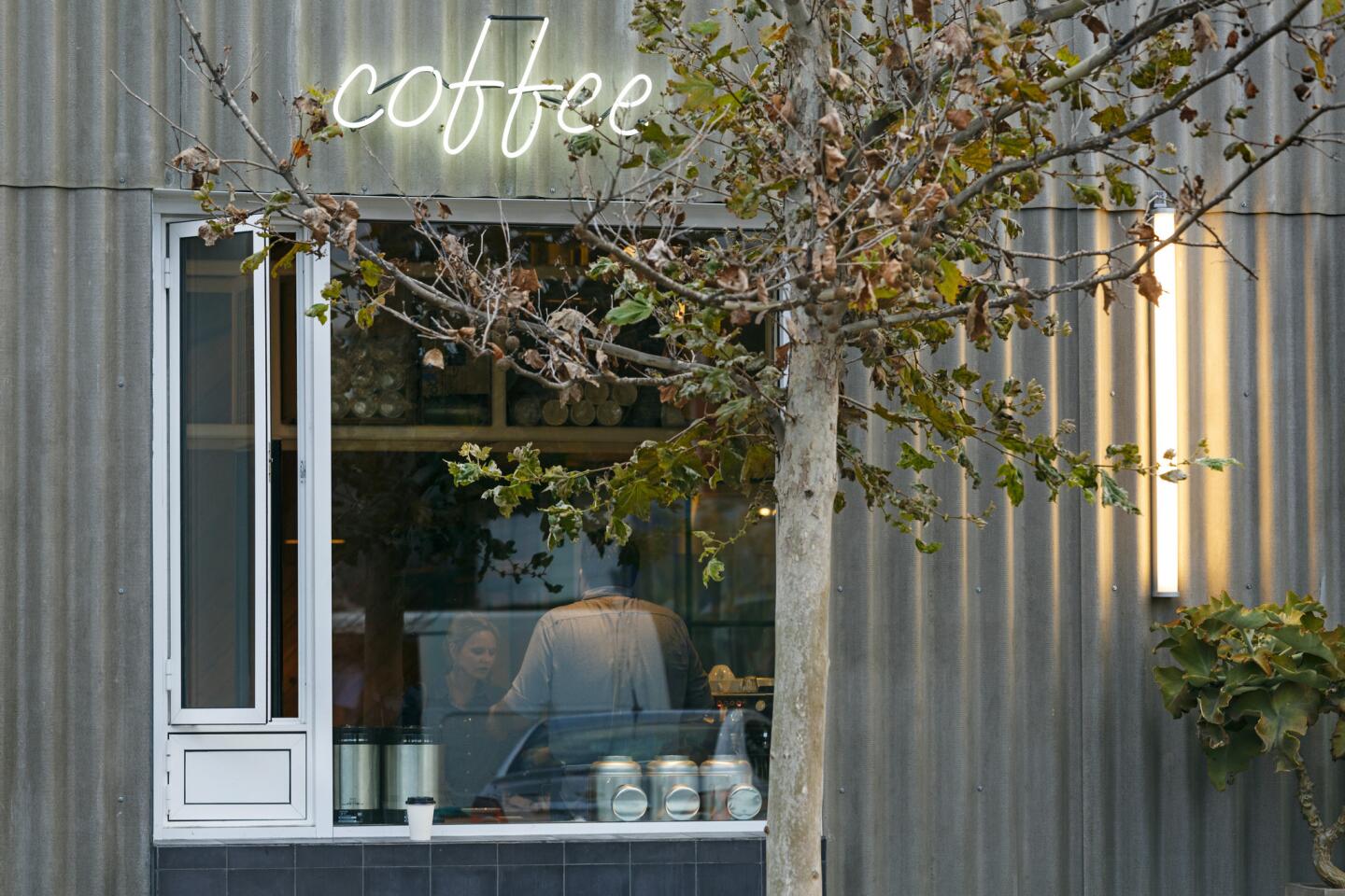
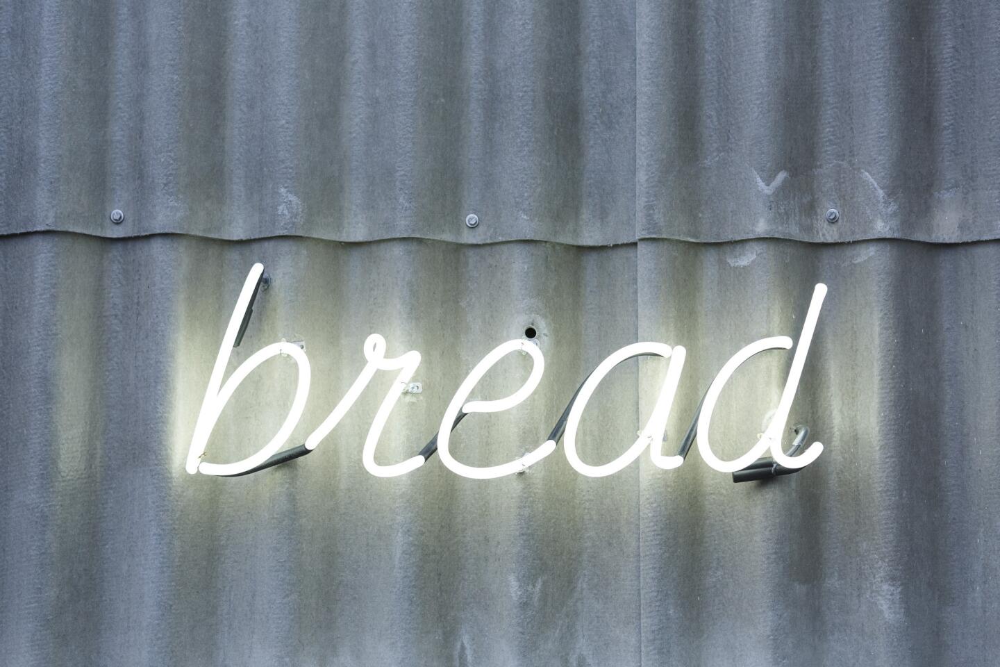
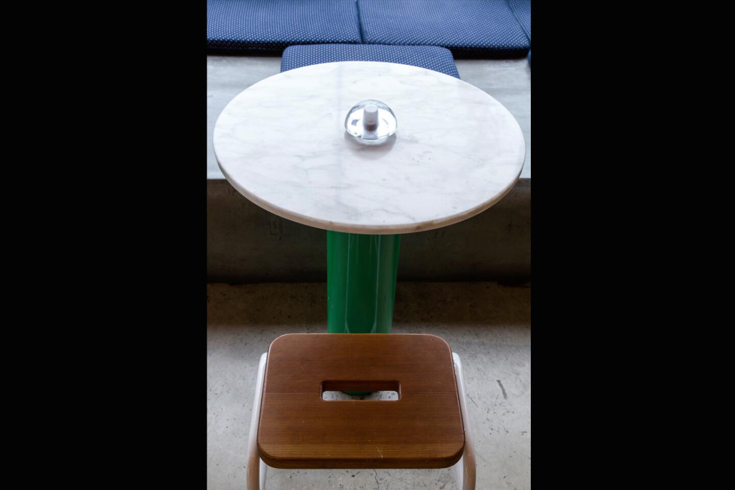
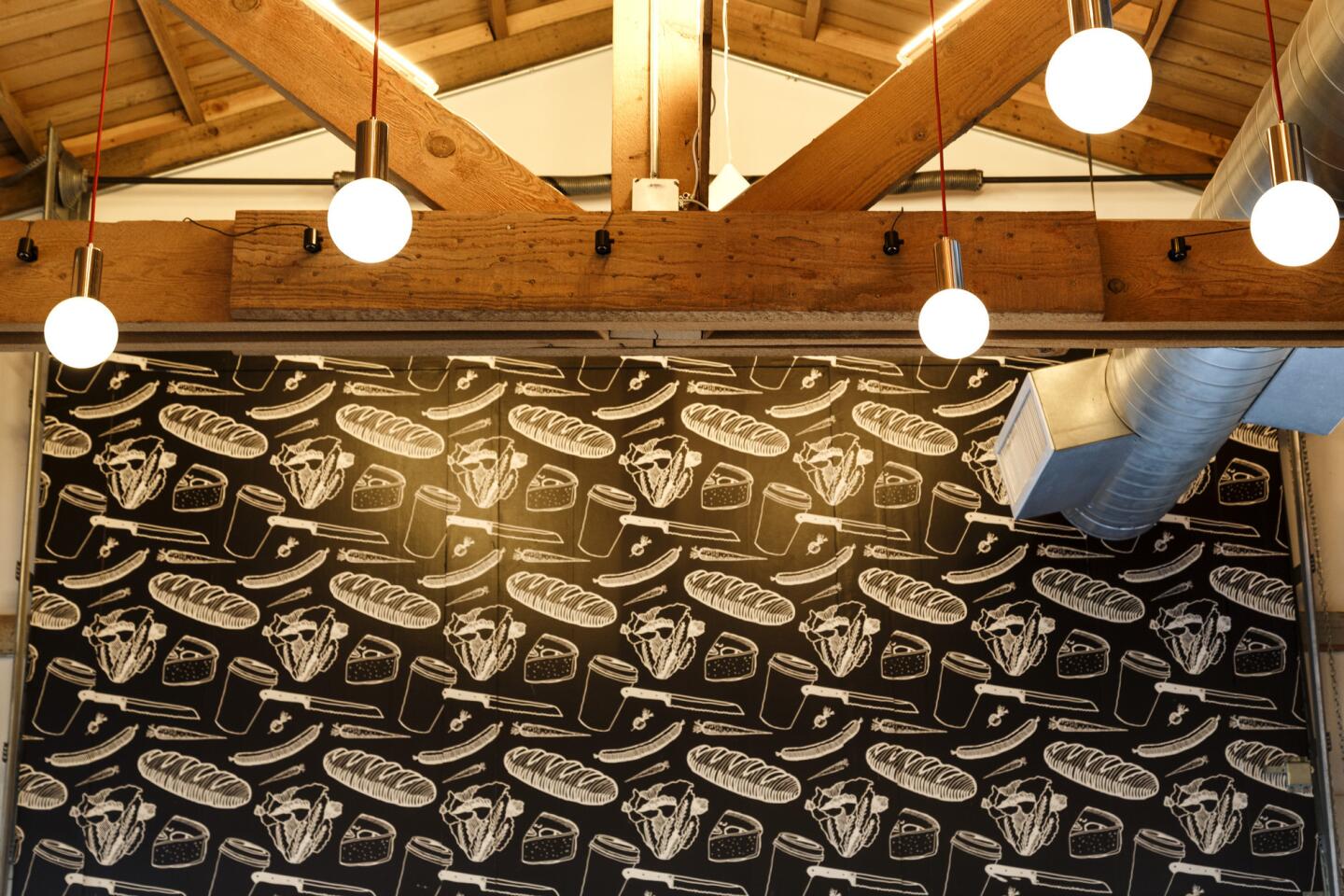
Superba Snack Bar (which won an American Institute of Architects 2013 restaurant design award) is dripping with Venice history and style, with raked stucco walls and swimming pool tiles on its patio. The Springs is a beachy haven in the middle of a concrete jungle; Oinkster shines as a modern-day burger joint; and the Coolhaus spaces epitomize food truck culture with a 1980s pop twist.
The Design, Bitches aesthetic is as diverse as Los Angeles. Unlike the designers behind the modern industrial look of Bestia (Studio Unltd and Osvaldo Maiozzi), the hippie-gone-glam vibe of Farmshop of Santa Monica and the Ace Hotel (Commune Design), and the bright, shabby chic of Gracias Madre and Cafe Gratitude in Venice (Wendy Haworth Design), Rudolph and Johnson create jigsaw puzzles with their spaces. They juxtapose the city’s hyper development, weather patterns and attitudes into fluid, tactile spaces you can experience.
Rudolph and Johnson are redefining SoCal dining style and, in doing so, showing us what it truly is — a mash-up of carefree beach vibe, cozy suburbia, taco stand culture and hipster cred, with a thoughtful nod to neighborhood traditions.
We sat down with Rudolph and Johnson to discuss what inspires their work and where they are taking their designs.
How did Design, Bitches get started?
Rudolph: We were working together at Silver Lake architect Barbara Bestor’s office. The AIA L.A. chapter had a competition in January 2010, in the depths of the recession, [to give] younger architects [something] to do to get them motivated. The contest challenge was “Architecture is: fill in the blank.” And the idea was to answer with a manifesto of what you think architecture is and a portfolio. So we thought, “For fun, we will enter a not-completely-made-up but semi-fictitious portfolio,” really for our entertainment. We had no thought of actually winning. So our answer to the question was: “It’s design, bitches.” We made up this whole identity and made a manifesto, made up some projects and included some real ones we had worked on together. It was very tongue-in-cheek. Now we have a real office, real employees and real work.
(The two started accepting jobs as Design, Bitches in January 2012 and work mostly out of an office at Rudolph’s house in Atwater Village.)
Johnson: We won an honorable mention, we got a plaque with our names on it, and it gave us this chance to re-tap into things that maybe we had been interested in and just hadn’t thought about in a really long time.... We shared a mutual frustration with architects taking themselves incredibly seriously, and the recession kind of prodded us to think bigger.
What was the thinking behind Superba Snack Bar and Superba Food + Bread?
Rudolph: For any project, we talk to the owner about the food, what kind of feeling they want and what their inspiration is. For Superba Snack Bar, we thought about the history of Venice. We wanted it to feel very Venice, but also to provide the atmosphere the owner and chef wanted so that it was comfortable, casual and high-end. The food is pretty elevated; it’s kind of the opposite of what the name means. We liked that idea of twisting things, and we just sort of collected inspiration and textures from the neighborhood, with things like the pool tile and the blanket ponchos we used for the banquette fabric. It’s all things you think about when you think about Venice, but we wanted to do it in a way that’s somewhat subtle. There are certain things like the raked stucco wall, which is a SoCal staple, the concrete under the bar and the floor, which [is covered with] little pebbles. They are all things you are used to seeing outside. We wanted it rough.
Johnson: There are these walls down by the [Venice] beach that have huge chunks of aggregate concrete and that look almost like they are ripping apart, like the materials just washed up on the shore, and the sedimentary layers are washing away. We liked that roughness. And with Venice, there is a little roughness. The whole patio [at Superba Snack Bar] is this kind of gathering place, kind of like the Dogtown and Z-Boys days. The pool tiles are a kind of homage to people coming together, so it’s like you’re hanging around the outside area of a pool.
Did SoCal food truck culture influence the Coolhaus spaces?
Rudolph: We thought of interesting and super-cute ways to make fun signage, and this was our first foray into balloons. [With Coolhaus, the architects have re-created the look of a late-’80s, early-’90s pop music video with stark white walls, silver balloons, playful graphics and a color-block back wall.] We used rubber for the counter, so that’s a direct reference to food truck culture … and we were kind of thinking about tire rims, but food truck culture wasn’t a direct influence.
What inspired the modern fast-food look of Oinkster?
Rudolph: We looked at a lot of classic burger joints and what Oinkster had already built up as an identity. There’s a lot to mine. We were inspired by Vans sneakers, checkerboard picnic blankets, and we made some gingham patterns. We thought about roadside stands and how you attract attention, because it’s very much car culture [on Vine], and you have to get people to stop. That played into the signage and graphics on the outside. We opened the building up a lot more and made it much more open to the neighborhood.
What places in L.A. inspire you?
Johnson: Everything, even the ugliest building. Carwashes in Los Angeles tend to have bold color schemes. I’m endlessly inspired by the 2nd Street tunnel. I love how the shape changes and how grimy it is and how shiny and sparkly it is. To me, this is L.A., and I love the sectional quality of downtown. There is a variety to the city and a “come and just do it” attitude.
Rudolph: We both get lots of inspiration from seeing things as we’re driving. One of my favorite things is this video-game store on Vermont [World-8]. It has this big orange sign, and I guess they sell games from the ‘80s. It’s anachronistic … and it’s really bright and colorful, and it just makes me happy. I’m also inspired by a lot of auto body shops, their signage. We love the outdoors a lot. Driving down PCH, the crazy, varied architecture of all those houses. It’s endlessly inspiring.
You are both into fashion and style. Which designers or artists do you look to?
Johnson: With fashion, there is a structural component to it.... There are so many things about fashion and what people are doing with fashion, even on a much smaller scale, that can inform architecture. I have a deep love for Alexander McQueen, although I don’t think it overtly represents itself in any way in the work we do.
[Then there’s] Rachel Whiteread. She’s a British artist who makes interesting materials, and there is always some sort of memory component to her work that I think is really inspiring. And more graphic things from Bridget Riley. She just made such beautiful patterns. And Sheila Hicks, who is a textile designer from the ‘70s; there’s just something about the roughness and the colors.
Rudolph: I love Miu Miu, Comme des Garçons. I like conceptual art, bland art, all the artists from the ‘60s. We look at all kinds of stuff. Local people like Mike Kelley, comic artists, graphic artists. For color inspiration, we’ll look at colors in graphic novels.
What’s next?
Johnson: We have this bar-arcade-restaurant project in Echo Park [Button Mash] opening in the summer. That’s another homage to L.A. for us, referencing different eras.
Rudolph: There’s ‘80s stuff with skateboard decks, toys and boomboxes [in the new restaurant]. For some reason there is also a little film noir detective thing coming into play. It’s the east end of Echo Park right before it goes up to Dodger Stadium; it’s close to Chinatown and the police academy. It’s not film noir in a theme-y way, but it somehow ended up in the mix, and we’re all excited about it.
Johnson: We’re also working on a coffee education facility for Counter Culture that will be open to the public and industry professionals. For us, the great feeling of success comes from people continuing to come back to the spaces and saying, “I never noticed that before,” after sitting in a different place.
We want to constantly surprise people, but not in a “check me out” sort of way. It’s more that they are looking around, living their life in that space, and that space is creating different moments for them. We want to create the kind of spaces you want to come to over and over, not like a one-hit wonder where you say, “I’ve been there, I saw it.”
This story is part of the Los Angeles Times’ Image Magazine spring fashion and travel issue.


Sign up for The Wild
We’ll help you find the best places to hike, bike and run, as well as the perfect silent spots for meditation and yoga.
You may occasionally receive promotional content from the Los Angeles Times.