


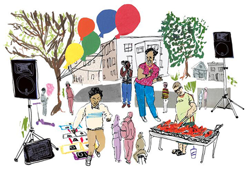


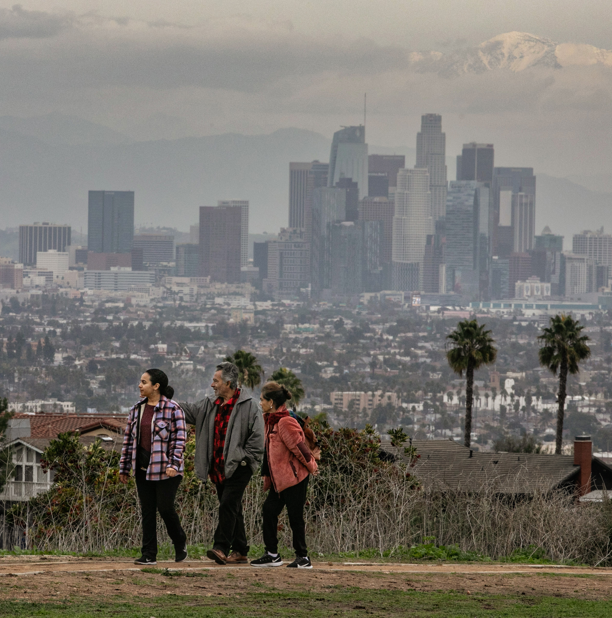
Best of Data and Graphics: 2023
Every year, the Los Angeles Times data and graphics team bring readers beyond the words. The year 2023 was bookended by violence — first in Monterey Park, then in Israel and the Gaza Strip. But in between, there was plenty of joy — a booming nature project, tubular teen turtles, and a bounty of drought-relieving snow. To facilitate some end-of-year bragging, we had our team’s journalists nominate a colleague’s piece of work, then conduct short interviews about how the projects came to be. Below you'll find 11 vignettes on the way these talented individuals think about data and visuals and how the team produces its part of the news. It's remarkable for us as readers to see the variety of stories represented all in one place, and for us as editors to hear about the care these journalists put into their work. We're proud of this group and are ever thankful to all of our collaborators throughout the newsroom.
Cheers,
Data and Graphics Director Hanna Sender and Deputy Director George LeVines
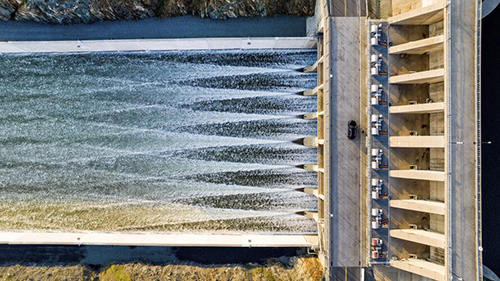
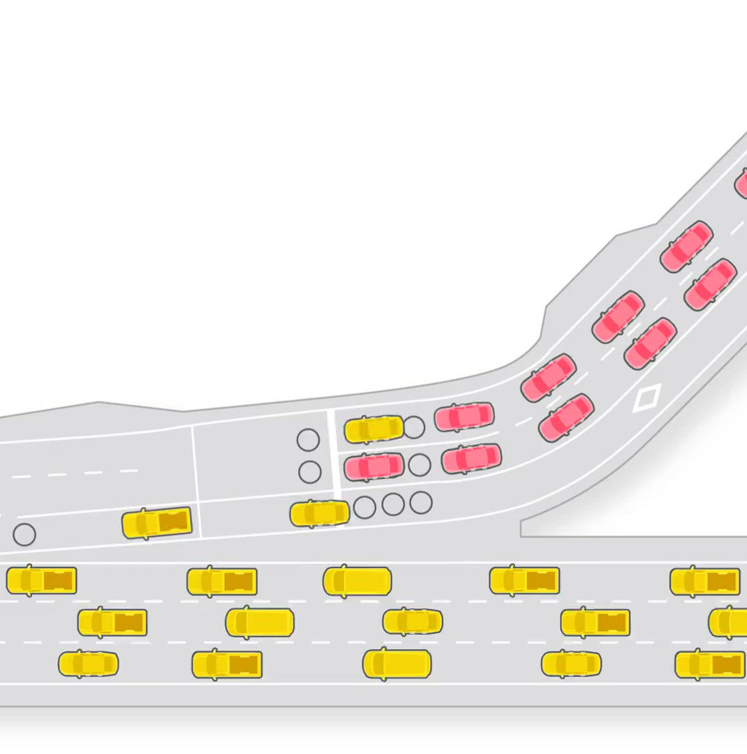
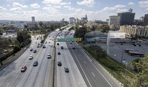
One car per green: Why the lights on freeway onramps can’t end traffic jams
“Lorena masterfully illustrates what’s happening behind the scenes of highway ramp meters. Like the story says, the traffic improvements they provide aren’t very noticeable, but Lorena’s graphics neatly show all the different data points transportation engineers collect when deciding how to handle congestion levels, and how they can ease gridlock in Los Angeles. (I’ll still complain during rush hour though).”
🤩 Phi Do, nominating Lorena Iñiguez Elebee's project on onramps and traffic jams in collaboration with staff writer Jon Healey
“Understanding key points to highlight was the beginning to illustrating the ramp system and animating how traffic flows in light- and heavy-congestion scenarios. This piece was very intricate in terms of producing it. At completion of the animated cars and traffic, I ended up finishing nearly 90 individual animation sequences.”
😎 Lorena Iñiguez Elebee
What causes the May gray that stubbornly blocks the sun for days in Southern California?
“Who can answer those weather-related questions we wonder about, in a very informative and engaging way? Our very own Paul Duginski, with his experience dedicatedly following the weather and his illustrative style. The piece "What causes the May gray that stubbornly blocks the sun for days in Southern California?" is one of several that has his signature weather-writing formula.”
🤩 Lorena Iñiguez Elebee, on Paul Duginski's story and illustrations on May gray
“I've done May gray and June gloom stories many times before, but I thought the causes were worth exploring once again. Over Memorial Day weekend, I saw reports saying that the siege of dreary skies was expected to continue unabated through the coming week. I thought, ‘Wow, this is all that people will be talking about for the next several days.’ So I got another May gray post together on Tuesday, and it did well with readers.”
😎 Paul Duginski
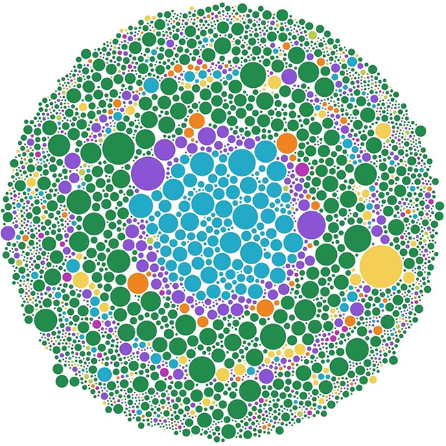
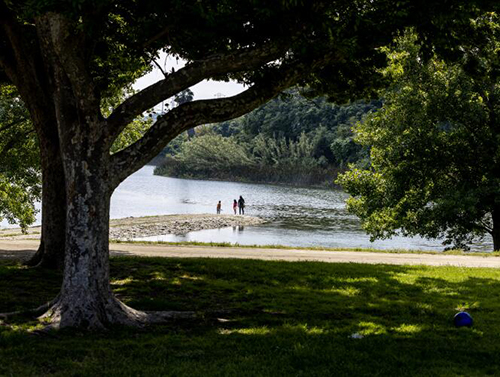
California started this community science project to document urban nature — now it’s taking over the world
“An unusual dataset. Bump and beeswarm charts. Photogenic squirrels. This story has it all — and was my introduction to an app that greatly improved my quality of life, iNaturalist.”
🤩 Aida Ylanan, on Sean Greene's illustrated story on documenting species for the City Nature Challenge using iNaturalist
“When I get stressed, I go out and look for bugs to put on iNaturalist. This was a dream story to report.”
😎 Sean Greene
Which Teenage Mutant Ninja Turtle are you?

“Such a fun piece — this one stands out to me for the subtle touches, like the pizza cursor, sneakily growing slime at the top of the page and the turtle shell flying across the screen. Added bonus that we were able to repurpose some of Vanessa's code afterwards for other projects.”
🤩 Abhinanda Bhattacharyya, on Vanessa Martínez's work on the Teenage Mutant Ninja Turtles quiz in collaboration with Phi Do and Sean Greene
“This project was really fun to work on in the short time that we had to make it happen. It was a team effort between departments, and looking at it now, I love how you can see the traces of everyone's creative ideas in the quiz and its design.”
😎 Vanessa Martínez
About 6,000 buildings in L.A. are at risk in an earthquake. Do you live or work in one of them?

“This piece manages to pull together a ton of data into an easy-to-follow, really usable format. With such a serious and scary topic, I love that there is a FAQ at the end so readers have tools to apply what they learn to their own situations.”
🤩 Gabrielle LaMarr LeMee, on Sandhya Kambhampati's work on a lookup map of retrofits in Los Angeles, in collaboration with Sean Greene and staff writer Rong-Gong Lin II
“What I love about data journalism is that I get to dive deep into a topic and learn new things. Now, if I go on a walk, I can point out which buildings are non-ductile concrete or soft-story. There was a lot of data cleaning and record searching that went into making sure the buildings were mapped accurately.”
😎 Sandhya Kambhampati
Was it L.A.’s dreariest, gloomiest, wettest winter ever? Here’s what the numbers say
“Just looking at the visuals, with their gloomy colors illustrating a period with more cloud cover than most recent years in downtown Los Angeles, threatened to trigger a touch of my seasonal affective disorder. I remember Phi working diligently to come up with a way to quantify the dreary first three months of 2023, and she succeeded.”
🤩 Paul Duginski, on Phi Do's work on winter in Los Angeles in collaboration with staff writer Rebecca Ellis
“Is it just me, or did it feel like 2023 was gloomier than previous years? It’s always satisfying to publish a story where the numbers can confirm your suspicions. Plus, I had a lot of fun chatting with meteorologists and learning how they track cloud cover.”
😎 Phi Do
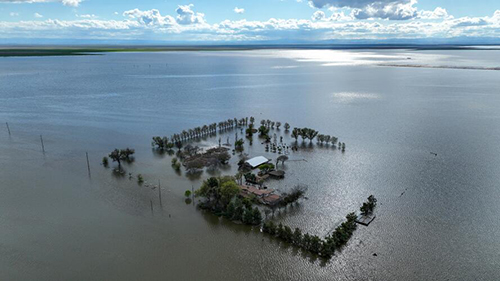
How powerful land barons shaped the epic floods in California’s heartland
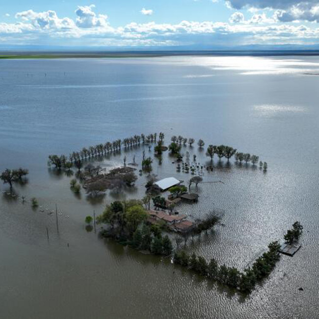
“One of the most powerful aspects of data journalism is being able to find out the answers to questions that no one knows the answers to. That's what Aida Ylanan did in this story about the historic flooding of the old Tulare lakebed. In this region of the Central Valley, powerful land barons control the flow of water through a poorly mapped system of levees. Through public records and careful analysis, Aida was able to identify the largest landholder in the lakebed. A series of elegant maps offer even more visual revelations and tell the story in ways that words simply cannot.”
🤩 Sean Greene, nominating Aida Ylanan's work on the historic flooding of Tulare Lake, in collaboration with staff writers Jessica Garrison, Susanne Rust and Ian James
“The data acquisition for this piece took me down many fascinating rabbit holes, from satellite data and imagery to sediment analysis of ancient lakes. Nailing down historical flooding and lakebed data took some time, but with the help of some friendly scientists we were able to track down the key pieces of information we needed for our analysis.”
😎 Aida Ylanan
Does your water provider have a contamination problem? Look up your local utility here

“I appreciate how this piece shows readers at a glance how their water supplier stacks up compared with others in the state. It's a smart and well-designed service piece.”
🤩 Sandhya Kambhampati, on Gabrielle LaMarr LeMee's water contamination project in collaboration with Katie Licari and staff writer Dorany Pineda
“Water-quality data is difficult to interpret. It took many calls with the Water Board to ensure our analysis was correct. The most exciting piece for me was receiving the list of systems that had sent out contaminated water notices — the only way to know that a system with contaminated water was not treating it to safe levels — information that had not been consolidated and shared anywhere else before.”
😎 Gabrielle LaMarr LeMee
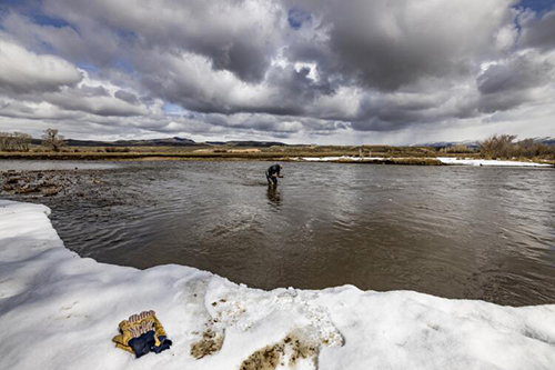
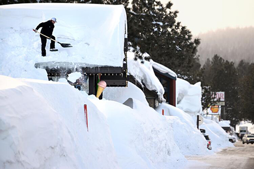
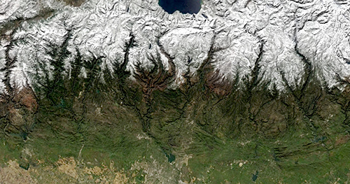
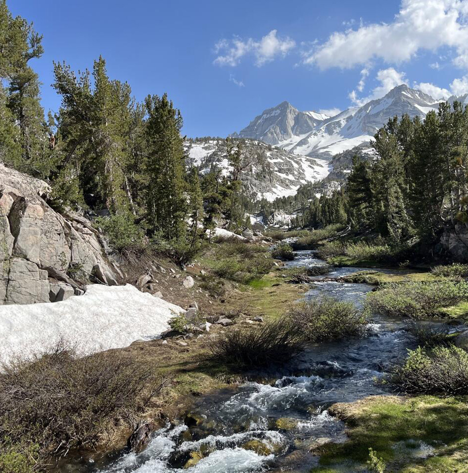
How much snow still covers California’s mountains this July?
“This year was atypical when it came to snow. In this story, Abhinanda Bhattacharyya explains how snow hadn't lingered this long into the summer in more than a decade, and reported on what effects and dangers these conditions could cause. This story stands out to me because Abhinanda not only reported this story, but took the photographs. The story includes maps that show snow cover in California over time, and images that leave you in awe. In these photos, Abhinanda captured just how beautiful the mountains were at that time of the year.”
🤩 Vanessa Martínez, on Abhinanda Bhattacharyya's work on the mountain snow
“It took several hours and a lot of back-and-forth with the National Oceanic and Atmospheric Administration (NOAA) to figure out how to extract, process and use the data behind the maps in the story, and then a few more hours to get the maps looking the way they did on the front end. This was one of those rare projects where I got to own each aspect — the reporting, data processing and visualization, and even the photos. It was a pain, and I also had so much fun with it.”
😎 Abhinanda Bhattacharyya
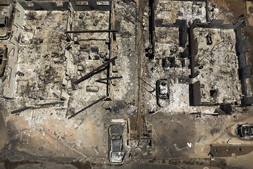
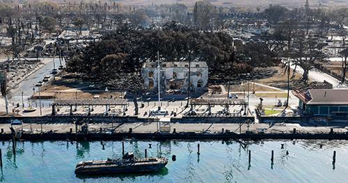
How the Maui fires consumed Lahaina
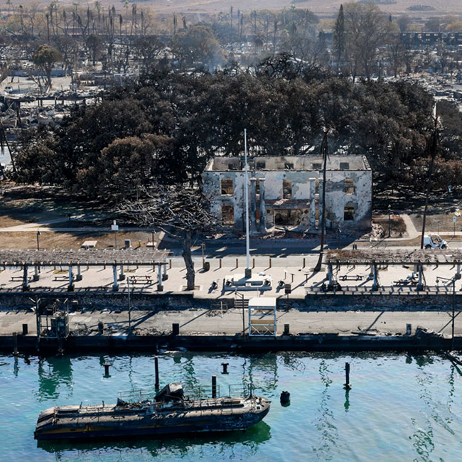
“How do you pull off a 3-D scrolling map on deadline? Call Iris Lee. In the days following the wildfire that destroyed the Hawaiian town of Lahaina on Maui, reporters were piecing together the details of what happened, and how. With calm and precision, Iris took in all of this information and translated it into a map that takes readers, hour by hour, through the events that led up to the deadliest U.S. wildfire in 100 years.”
🤩 Sean Greene, on Iris Lee's map of the Maui fires in collaboration with him, staff writer Rong-Gong Lin and Vanessa Martínez
“I loved working on this project because it demonstrates the power of visual storytelling. By using interactive maps, satellite images and spatial data, we were able to take our readers through a complex event, which wouldn’t have had the same impact had we used only text. It was great to see a deeply reported story come to life on screen.”
😎 Iris Lee
Making travel plans? Southwest’s holiday meltdown may be a sign of air travel drama to come

“The infamous Southwest Airlines meltdown of the 2022 holiday season left many Americans scratching their heads: How could this happen? For this story, Katie Licari figured that out. A primary factor was how the airline configures its network of flights, which ultimately left airplanes, pilots and crew grounded and stranded in blizzard conditions. The finding came out of an analysis of 87,000 domestic flights over the holiday period made by Southwest and American Airlines, and required Katie to quickly learn the ins and outs of airline logistics and business strategies. No easy feat.”
🤩 Sean Greene, on Katie Licari's work on the Southwest holiday season meltdown, in collaboration with staff writer Samantha Masunaga and Vanessa Martínez
“During the Southwest meltdown, Vanessa Martínez and I knew we could use flight path data to clearly visualize the impact of Southwest data. We had to standardize the time data to correctly handle flights going between different time zones and geocode them to account for the curvature of the earth. We were able to clearly visualize the direct to destination model Southwest employs led to the airline having more intense delays and a longer recovery compared to American Airlines which employs a hub model.”
😎 Katie Licari