The letter-perfect logo
Into the still-unbuilt Los Angeles Hall of Fame -- in a niche between, say, the late Garfield High calculus teacher Jaime Escalante and the nameless guy who planted the first jacaranda -- let us now enshrine Tim McAuliffe. Not even an Angeleno, McAuliffe still deserves induction for the quick note excerpted just below. See how long it takes you to guess the subject:
FOR THE RECORD:
Dodgers: In an April 13 Op-Ed article, the creation of the Dodgers’ interlocking L and A cap logo was attributed exclusively to team executives in the late 1950s. The L.A. Angels of the Pacific League (1903-1957) had a similar logo. —
Dear Art:
Thank you for your letter, I am making up two new L.A.’s for Buzzie . . .
I will design them in the upper corner to show you what I mean, one will be identical with the LA I gave you only larger, and the other which is designed has the lower bar of the L, acting as a cross bar of the A . . . “
Figure it out yet? Does it help to know that the letter carries a date of Dec. 11, 1957? That “Buzzie” is Buzzie Bavasi, the longtime executive vice president and general manager of a certain storied sports franchise?
McAuliffe was, in fact, the man who designed the immortal interlocking L and A for the Dodgers, who take the field for their home opener Tuesday. McAuliffe, at the time a Boston-based purveyor of “quality athletic equipment,” didn’t do it alone, of course. According to Dodgers team historian Mark Langill (a job title right up there with “professional candy-eater”), thanks for the idea go to some combination of Bavasi, owner Walter O’Malley and the “Art” of the letter, Dodgers publicity director Arthur “Red” Patterson. Not that anybody’s fighting over the credit. Like a little dunker behind short, the glory lands untouched.
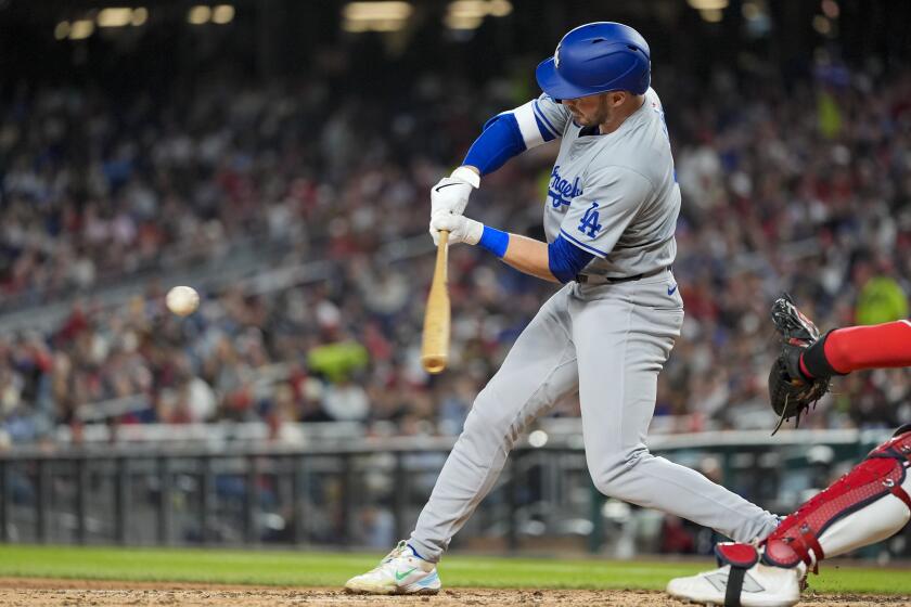
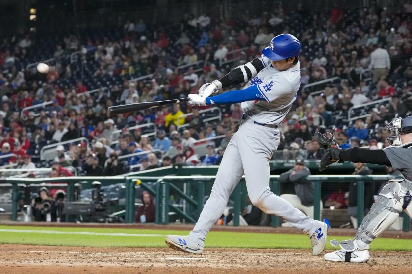
Whoever takes credit for it, the Dodger symbol represents a triumph of logocraft. On a purely aesthetic level, the Dodger insignia is, demonstrably, the most beautiful in all of baseball.
Consider the competition. The hated Giants followed the bums west and copied our entwined lettering and Varsity typeface, but their Halloween-ish orange and black vitiate the overall effect. The Yankees’ traditional black-and-white NY logo -- currently on view citywide in ads hyping their midsummer visit to Dodger Stadium -- has always been an abomination, suggestive of bats carelessly jumbled in a dugout barrel. And the Angels’ sole scarlet letter A, straight out of Nathaniel Hawthorne, clashes incongruously with its own halo.
Even outside baseball, with the possible exception of that Western Exterminator guy with the mallet behind his back, the Dodgers have little competition in the logo department (if not, sadly, in the NL West).
And unpacking this image, we find the very virtues that have always characterized, at its best, the Dodger way to play baseball: thrift, teamwork and a strong connection to the surrounding city.
Thrift, because nothing is wasted. “The lower bar of the L,” as McAuliffe put it, doubles as “a cross bar of the A” -- not unlike the multitalented pitcher Orel Hershiser offering his services to Tommy Lasorda as a pinch-hitter on off days. When the Dodgers deviate from such versatile self-sacrifice by, say, overspending on a free agent, they usually, sometimes literally, pay the forfeit.
Teamwork, because the letters don’t just share that crossbar, they overlap and interlock. This is how baseball is supposed to work, as set forth in Al Campanis’ classic 1954 manual, “The Dodger Way to Play Baseball.” Get on base, set the table, move the runner over, play hurt, take one for the team. (If any Dodger forgets how to play the game, the answer is never farther than his own forehead.)
And connection -- no one calls Boston “B,” and NYC isn’t generally known as “NY” but we go by “L.A.” at least as often as Los Angeles. Curiously, though, in the 1940 WPA guide to Los Angeles, the abbreviation L.A. doesn’t appear once -- giving rise to the speculation that before the Dodgers came west, people may not have thought of Los Angeles as L.A., or not nearly as ubiquitously.
Since I moved east of the L.A. River, I see the Dodger logo more often than ever. At the Denim Exchange on Cesar Chavez Avenue, they sell about 30 different Dodger caps. You can buy the raised white “LA” stitched onto blue caps and black ones, brown ones and red ones, caps with paisley backgrounds and caps that look like hideous Color Tile flooring circa 1978. Whatever the headlines say, no city this much in love can ever be completely bankrupt.
Of course, not everybody waxes sentimental about the L.A. logo. Mid-century Dodger ace Carl Erskine e-mailed to say, “My son Danny was nine years old and was invited to be on the Art Linkletter show ‘Kids Say the Darndest Things.’ When Art asked Danny what the L.A. stood for, he said, ‘Lost Again.’ ”
So far this season, Danny’s point stands. The Dodgers are making news everywhere but the sports pages, and they got off to a slow start last week. Still, you’d never know it to walk down my block, and until Professor Scully takes the microphone today, it’s all spring training anyway.
My new neighbors have already taught me how to make the Dodger logo with my fingers. First the left hand makes an inverted peace sign. Behind it the right hand makes an L, forefinger skyward, the thumb crossing the A just so. That versatile opposable thumb, as Darwin well knew, is all that separates us from the Angels.
The former book critic for the San Francisco Chronicle and director of literature for the National Endowment for the Arts, David Kipen has just come home to Boyle Heights.
More to Read
Are you a true-blue fan?
Get our Dodgers Dugout newsletter for insights, news and much more.
You may occasionally receive promotional content from the Los Angeles Times.

