Metro rail stations are being planned with design in mind
The London Underground logo is instantly recognizable. So are the entrances to the New York City subway.
But in Los Angeles?
“It’s all over the map,” said Martha Welborne, the Los Angeles County Metropolitan Transportation Authority’s executive director for countywide planning. “People rarely know what a station will look like.”
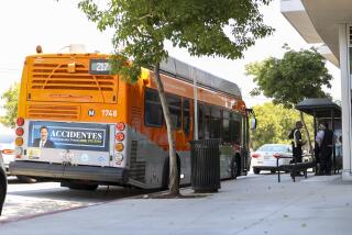
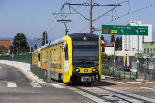
The system’s 80 train stops play host to more than one thousand design variations, from architectural differences to a range of trash cans and paint colors. In Chinatown, Gold Line riders see pagodas; in Highland Park, chairs that resemble dice. The Norwalk Green Line station is bee-themed, including honeycomb tiles.
As a part of the county’s nascent rail boom, which over the next decade will double the number of Metro train stations, officials have adopted one signature look. The aim is to eliminate the previously scattershot approach to design and make the system feel more sophisticated and durable. The template, which staffers call “a kit of parts,” calls for simple, even utilitarian, elements that can be rearranged to fit underground, ground-level and elevated stations.
“The philosophy is, ‘Less is more,’” said Brian Knight of Johnson Fain, the architecture firm that drafted the plans.
The new design marks the first truly cohesive look in the 25-year history of Los Angeles’ modern rail network. It should appear by 2023 in three key projects: the Crenshaw Line, the Downtown Regional Connector subway and the first phase of the Purple Line extension.
Most recognizable will be a paneled canopy of fused ceramic and glass, hanging at the entrance to each station. Previously, entryway design ranged from circular, space-age structures in downtown Los Angeles to a band-shell-like design in North Hollywood.
“There’s a lot of visual chaos in Los Angeles transit,” Welborne said. She said the agency’s 80 existing stations won’t be changed. Nor will the lines already under construction: the Gold Line extension and the second phase of the Expo Line, which are both scheduled to begin service in 2016.
About 1% of every Metro-project budget goes toward station artwork. Artwork will give each station a unique sense of place, Johnson Fain staff said.
“Good stations have elements that are consistent,” said UCLA urban planning professor Anastasia Loukaitou-Sideris. “Although it’s OK, even fun, to have an element of surprise.”
The designs are intended to help passengers find their way through the system. Every station object, from televisions to turnstiles, will have a uniform look. Like elements will be grouped together.
The changes also should make maintenance easier and cheaper, Welborne said. Currently, some stations use 10 colors of paint. Gates and tiles vary from station to station, and some art installations need light bulbs that are no longer manufactured.
Yet to be decided: color, if any. A hue can be so defining, Welborne said, that making that decision will likely be “sort of a minefield.”
More to Read
Sign up for Essential California
The most important California stories and recommendations in your inbox every morning.
You may occasionally receive promotional content from the Los Angeles Times.
