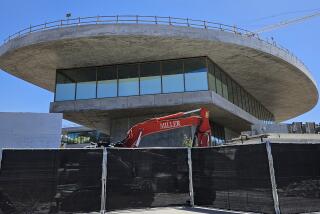
Zumthor’s LACMA design has potential, but think of the factory model
The $650-million plan to remake the jumbled campus of the Los Angeles County Museum of Art on Wilshire Boulevard is the fourth such effort in the last three decades.
Challenging in concept and architecturally ambitious, the design by Swiss architect Peter Zumthor, 70, unveiled in a summer exhibition closing next Sunday, also can’t help but make one wonder about the apparent difficulty in building good museum galleries.
Is it really so hard?
Here’s a quick, relatively inexpensive and aesthetically surefire way to construct a first-rate museum building for art. It turns out to be as simple as one, two, three.
PHOTOS: A fresh perspective on LACMA’s ‘old’ buildings
1. Hire a capable engineering firm to build a big, sturdy factory or warehouse.
2. Engage a talented architect to retrofit the big, sturdy factory or warehouse to accommodate the specific demands of an art museum program.
3. Open the retrofitted building to critical acclaim and public enthusiasm.
That’s roughly what happened in 1983, when the newly organizing Museum of Contemporary Art opened what was planned to be a temporary exhibition space in Little Tokyo. The 1947 Union Hardware buildings were minimally refurbished by architect Frank O. Gehry.
Soon after, it happened again in Europe. This time the Hallen für Neue Kunst — Halls for New Art — had its debut as a museum for a private collection in an old textile factory on the banks of the Rhine in the Swiss city of Schaffhausen.
MOCA’s cleaned-up warehouse was such a hit that temporary became permanent. The art public wouldn’t hear of closing the space, just because a brand spanking new — and aesthetically iffy — MOCA building opened on Grand Avenue.
It wasn’t the first such adaptive reuse of an existing industrial building, but it did become the template for similar triumphs elsewhere. MASS MoCA (1999) opened in a run-down complex of former textile mills and electronics factory buildings in New England. London’s Tate Modern (2000) became one of the world’s most-visited art museums after moving into the defunct Bankside Power Station on the Thames. Dia:Beacon (2003) is housed in a 1929 box-printing facility along the Hudson River in Upstate New York.
Lots of people have raised lots of questions about the host of brand-new museum buildings constructed in the last 30 years. Are they functional? Economically viable? Congenial viewing spaces for art? Some are, some aren’t; but museums housed in refurbished factories and warehouses tend not to be among those deemed flops.
What can we learn from this? I used to think that old industrial spaces made for good art museum galleries because artists today often work in exactly those sorts of buildings. So why shouldn’t art produced in an industrial environment look best when shown in the same sort of place?
MOCA, after all, like Schaffhausen, MASS MoCA, Tate Modern and Dia:Beacon, is dedicated to Modern and contemporary art, not to Old Master paintings, South Asian sculptures or Safavid dynasty carpets. Yet, think about it: Would Old Master paintings, South Asian sculptures or Safavid dynasty carpets really look so bad in the rooms in Little Tokyo or at Tate Modern?
RELATED: A tour of Los Angeles’ boulevards
My guess is that they’d look pretty smashing. Great art would look great regardless of the type of architectural space where it was shown. (Texas’ San Antonio Museum of Art, which has diverse collections that include ancient Greek and Colonial Latin American art, even got the jump on MOCA when it began renovating an old brewery in 1981.) When I’m absorbed in an exceptional artistic experience, the surroundings tend to fall away anyhow. Give me adequate light and a place to sit down once in a while, and that’s about enough.
Frankly, we spend too much time fretting about art museum buildings. In the end, museum architecture just doesn’t matter much to me — except insofar as I enjoy architecture of any kind.
The adaptive reuse of existing buildings, including schools and offices, as art museums has been around for a long time, in locales as diverse as Long Island City, N.Y., and Sydney, Australia. Of them, industrial space has proved to be the most flexible and functional kind. I now think the nearly universal success of refurbished industrial buildings as art museums has less to do with any similarity between those buildings and the works of art inside than it does with a fundamental difference.
Factories and warehouses speak the vernacular architectural language of ordinary people and everyday life. Art, by contrast, does not.
Art thrives on originality and uniqueness. Install the extraordinary inside a vernacular building, and everyday experience is galvanized and transformed. That’s the aesthetic value of complexity and contradiction, as architect Robert Venturi once famously put it.
PHOTOS: Arts and culture in pictures by The Times
And speaking of vernacular architecture: Is it any wonder that hands-down the most brilliant new building of the last half-century — the Guggenheim Bilbao — is an art museum designed from scratch by Gehry? He’s an architect whose achievement derives from his acute sensitivity to vernacular building materials and motifs.
None of this is to suggest that Zumthor’s eccentric design for LACMA, which is still in its preliminary stages, doesn’t have potential. It most certainly does.
Yes, the undulating, organic footprint of the plan, which evokes (and encroaches on) the primordial ooze of the adjacent La Brea Tar Pits, is a bit corny. But its elevated, single-story emphasis on an uninterrupted, horizontal expanse of galleries is commendable. So is the savvy plan for viewable open-storage of museum collections.
And no, its gallery walls don’t curve, thus avoiding problems like those at New York’s spiral Guggenheim or in the doughnut-shaped Hirshhorn Museum in Washington, D.C. Orthogonal rooms are inserted inside the building’s undulating perimeter, which functions as a glass-walled promenade with views out to the surrounding park and cityscape. If an aerial view of the galleries looks like a street map of L.A., the promenade is its Mulholland Drive.
Zumthor’s design smartly builds on much of what came before — especially the thrilling, unrealized, 2001 Rem Koolhaas scheme to tear down most of the existing, barely mediocre museum complex and erect a single new pavilion lifted off the ground.
Like Koolhaas, Zumthor recognizes that, save for empty nostalgia, there’s no reason to retain buildings that function poorly, have been radically altered over decades and now require hugely expensive renovation. That’s the case with the original 1965 William Pereira design, never mind the grandiose, flatly awful “Hollywood Egyptian” expansion from 1986 by Norman Pfeiffer of Hardy Holzman Pfeiffer Associates.
Better to start over.
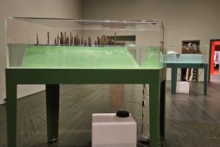
For Zumthor, that includes designing lots of different kinds of interior gallery spaces. He has limited experience building them — Austria’s 1997 Kunsthaus Bregenz and the 2007 Kolumba Art Museum in Cologne, Germany, are the only two — modest display spaces that I’ve only seen in photographs. But the 10 study-models of possible galleries at LACMA are ample evidence of the care he takes with his designs.
Clearly they are a work in progress. Take the vast room with what appears to be concrete walls and a floating, translucent ceiling to diffuse the bright California light. Judging from the size of cut-out figures of visitors in the model, the gallery approaches a whopping 40 feet in height. Paintings are little rectangles lined up around the base of a nearly four-story room.
As I say, absorption in exceptional art tends to make the surroundings fall away, so maybe the gallery’s epic scale won’t be crushing. Maybe it will even heighten the experience by giving a visitor an emotional sense of poetic sobriety, one that flows from the prehistoric context of the tar pits out the window.
Oddly, the project’s most hopeful element might be its unexpected color — or lack thereof, as implied in the architect’s nickname for the new LACMA building: the Black Flower. A soft and layered black was also Zumthor’s choice for his temporary, widely admired 2011 Serpentine Pavilion in London’s Kensington Gardens. In contrast to more usual beige travertine, granite and marble or light gray concrete, black is nothing if not counterintuitive.
Zumthor has said that powerful architecture is finally about atmosphere, not form. But then, so are retrofitted factories or warehouses as civilized museum spaces to house extraordinary works of art. What we do know for certain is how very well those have turned out.
christopher.knight@latimes.com
More to Read
The biggest entertainment stories
Get our big stories about Hollywood, film, television, music, arts, culture and more right in your inbox as soon as they publish.
You may occasionally receive promotional content from the Los Angeles Times.


