New Colors Proposed for MTA Buses
Would you ride a bus because of its color? The Metropolitan Transportation Authority certainly hopes so.
Transit agency staff members on Thursday proposed a revamped graphic scheme for its buses and trains, a move meant to “brand” MTA vehicles in the hope that bold, new colors would boost stagnant transit ridership in Los Angeles County.
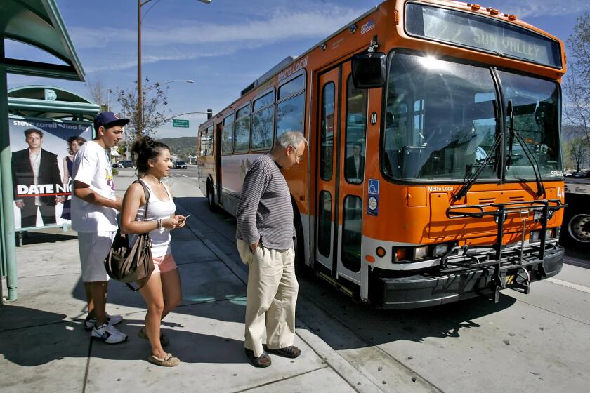
If the proposal is adopted by the MTA board, the current fleet of buses and trains -- painted white with orangish stripes -- would soon give way to color-coded buses decked out in bold red, orange or blue, and trains adorned in silver.
The proposal builds on the momentum of the Rapid Bus, the highly successful express service that runs on four routes in Los Angeles but is slated to expand to 27 routes over the next five years.
Rapid Buses are painted bright red, and transit officials believe their unique look partly explains why they have become some of MTA’s most popular carriers.
As it does with the Rapid Bus, the agency now wants to match each type of bus service with an easily identifiable color. Local buses, which make frequent stops and provide the bulk of MTA’s service, would be an orange that MTA Chief Executive Roger Snoble described as “California poppy.”
Limited-stop buses that run on freeways would be “periwinkle blue.”
A swath of reflective silver would adorn the bottom third of the buses, making them easier to see at night.
“It’s branding,” said John Catoe, MTA’s deputy chief executive. “We are creating something that is identifiable in the public eye. It’s friendlier. It’s more modern.”
Added Maya Emsden, MTA director of creative services: “It’s a hipper bus. It’s a cooler bus. We live in Los Angeles; we shouldn’t be afraid to be bold.”
Catoe said that if the MTA board grants approval -- the matter will most likely be taken up Thursday -- the new color scheme would be phased in over three years, with the fleet’s 2,400 buses getting the new colors whenever they need repainting.
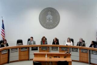
The color scheme clearly pleased the MTA board subcommittee. But some were skeptical of a proposal to do away with the old MTA logo, a roundish M sometimes placed within a circle.
Emsden, the creative services director, said the old logo is not doing its job. In surveys, many residents say they have no idea what the logo represents. Emsden proposed a new logo that she promoted as artistic and unique, with a bolder typeface, sharper edges and a slash through a portion of the letter.
Hal Bernson, MTA board chairman and Los Angeles city councilman, said he does not like the proposed logo. “It may be very arty and very fashionable, but I’m not sure it is going to be as recognizable as we think it is.”
Bernson instead proposed that MTA use a cartoon character -- “like a roadrunner” -- to use along with its current logo. The cartoon character, he said, would create a friendlier, more lasting public impression. Bernson’s idea was met with blank stares, rolled eyes and silence.
MTA board member Zev Yaroslavsky then said he first saw the proposed logo Wednesday. “I didn’t like it then,” he said. “Today, I like it.”
“Well, maybe I’ll like it tomorrow,” Bernson replied.
More to Read
Start your day right
Sign up for Essential California for news, features and recommendations from the L.A. Times and beyond in your inbox six days a week.
You may occasionally receive promotional content from the Los Angeles Times.
