Creating an Identity With Eye-Catching Color, Design
- Share via
The mix of chrome yellow, purple, turquoise, vermilion and white in assorted geometric shapes on the banners certainly catches your eye, as it was meant to do.
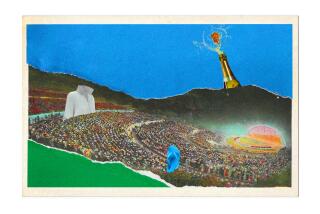
Draped from lampposts on stretches of Cahuenga Boulevard West in Hollywood and on Wilshire Boulevard in Westwood, the brightly colored banners of silk-screened vinyl celebrate the Hollywood Bowl’s summer festival of concerts (that begin July 1).
The approximately 3-by-8-foot banners also are used for orientation--on Cahuenga to announce that you’re in the vicinity of the Bowl, and in Westwood to locate the Bowl’s park-and-ride departure point, off Veteran Avenue behind the Federal Building at 11000 Wilshire Blvd.
The banners, incorporating an assortment of geometric shapes inspired by the Bowl’s logo, are part of a graphics program being developed by the design firm of Sussman/Prejza & Co. to lend the venerable festival a more pronounced visual identity.
Such coordinated design programs involving coloring, lettering and signage are becoming more and more popular here. This in part is in reaction to the harsh fact that as the Los Angeles region has become more urban, it also has become more difficult to locate buildings and places.
Another fine example of the work of the Sussman/Prejza firm can be found in Crocker Center, off Hope Street on Bunker Hill. There the use of colors and lettering is subtle and rich (check out the copper and brass building directory). The warm hues and elegant lettering go well with the slick, late-Modern-styled, red granite-clad twin towers designed by the San Francisco office of Skidmore, Owings & Merrill.
In contrast to the subdued corporate tone of Crocker Center are the exuberant colors (turquoise blue, light yellow ocher, dusty coral and purple, among others) Sussman/Prejza selected to decorate the populist Post Modern-styled Westside Pavilion shopping mall at Pico and Westwood boulevards, and the more ambitious Horton Plaza in downtown San Diego. Both projects were designed by the Jerde Partnership, which Sussman/Prejza worked with on the design of the 1984 Olympics.
If any one effort raised the public consciousness of the use of coloring and graphics, it was the Olympics. To locate, unify and celebrate the various sports venues scattered across the Southern California suburbanscape, a consistent set of colors, including magenta, chrome yellow, vermilion and aqua, were used on banners, bunting, balloons, tents and temporary structures. The impact on the design field is still reverberating today.
Also involved in the graphic design of the Olympics was Gary Hinsche, who like Sussman/Prejza has taken that unique summer experience and applied it to a variety of civic and commercial projects. Among them are complete identity and “signage” programs for the Burbank Redevelopment Agency and the city of Santa Monica, both of which will soon be on display.
Very much on display at present is what Hinsche + Associates did to decorate and identify the Home Club, a home improvement discount outlet at 101 E. Redlands Blvd. in San Bernardino.
There they took a drab 30-foot-high concrete building and had painted on it--in bright shades of orange, red, green, blue and lilac--a giant saw, a wrench, a hammer, a faucet and a light bulb, with a few roof extensions to allow the elements to rise above the structure. And of course some banners were added as well.
Not coincidentally, decorating the building in such a way avoided any conflict with local ordinances that restrict the types and sizes of signs. You don’t need a sign to tell you that the box of a building on Redlands Boulevard is the Home Club. The building in effect is the sign.
In an increasing chaotic suburbanscape, any help in telling you where you are is appreciated.
More to Read
The biggest entertainment stories
Get our big stories about Hollywood, film, television, music, arts, culture and more right in your inbox as soon as they publish.
You may occasionally receive promotional content from the Los Angeles Times.


