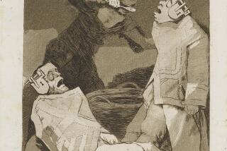
The Difficult Type : Unlike Tidy, Traditional Typefaces Such as This, the California-Bred ‘Garage Fonts’ Above and Below Are Messy, In-Your-Face and--Gasp!--Multiplying
- Share via
Degenerate. International Disgrace. Futile.
Nasty words, those, but then that’s by design. They’re some of the puckishly post-punk names for bizarre new typefaces that are breaking all the rules: Bits are chopped out of letters or blobs added on. They’re blurry and messy. Indeed, fonts are undergoing yet another evolution in design--decades after reaching the peak of classical perfection and then surviving the graphic challenges of psychedelia and punk.
With the harmony of evergreens like Gothic and Roman out of the avant picture, scrappy seedlings like Bastardville and Dead History Roman are springing up in alternative magazines aimed at urban youth. And now they’re even beginning to infiltrate the imprimatur machine of pop culture. They’re cropping up everywhere, from mainstream magazines to movies.
“There’s no question it’s filtering in slowly,” says David Carson, a magazine designer who’s a prime proponent of the new grass-roots typefaces, dubbed “garage fonts.”
“MTV had something to do with that. Literally, over 10 years now, people have watched that. They can’t do that and not have it affect how they visually take in information.”
Funky fonts have also been fueled by the arrival of desktop publishing, which has given designers the ABCs to craft their own letters. But, like many technology-driven marvels, the first blush of novelty has been followed by a second wave of quandaries, both ethical and aesthetic. Since typefaces can’t be copyrighted, some font creators have had to grapple with pirates. And while fans hail the expressiveness of the new fonts, some critics assail the trendy designs for being ephemeral and, sometimes, simply unreadable.
“It’s the difference between the culture of obsolescence and the culture of refinement,” says font critic Massimo Vignelli, a prominent modernist designer. “In the cult of refinement, you don’t need to come up with the junky typefaces they’re coming up with today. They’re junky because they have no style, no background, no depth, no elegance, no history.”
Nowhere has the garage font debate simmered more lately than in California, where forward-looking ‘faces are born and bred. Some of the flashiest made their public debut in Beach Culture, an alternative magazine that made a big splash in the design world during its brief life. With only six copies published in 1990 and ‘91, Beach Culture nonetheless garnered dozens of design awards for its “radical typography and design tomfoolery,” as Print magazine admiringly described it.
Beach Culture’s ruling duo, art director Carson and editor-publisher Neil Feineman, looked toward influences Fabien Baron of Interview magazine and Neville Brody of the British publication The Face in designing their San Juan Capistrano-based journal of surfer style and music.
The idea was that the magazine’s look should link arms with its words to express content. To that end, Carson and Feineman used nutty type, overlapped it, shrank it, dispensed with page numbers and literally turned language on its ear. Not surprisingly, Beach Culture developed a cult following among designers, who made up half its readership.
“We wanted to be different,” says Carson, who first plunged into the brave new world of eccentric magazine design in the mid-’80s. “We wanted to see if you could, in fact, get away with more things in magazines. It was largely an experiment. We hit some nerve out there. We still get letters almost weekly asking to subscribe.”
Print magazine applauded Beach Culture as “a small jewel of experimental design.” Key to that success was Beach Culture’s use of strange new typefaces. Carson started with fonts developed by Emigre Graphics, a pioneering new font foundry in Sacramento, and began to use designs by students at California Institute of the Arts and Cranbrook Academy of Art in Michigan. Some student designers have come to specify that only Carson can use their designs.
“They feel it’s a part of them and they have this fear about this thing just being out there for unlimited commercial use . . . so I have a number of fonts that nobody else in the world besides the student has,” says Carson, who now uses them for a new Santa Monica-based magazine he designs, Ray Gun, music + style (bible of).
*
Rodney Fehsenfeld is a Seattle designer who funnels his fonts to Carson and to Mondo 2000, a San Francisco-based cyberpunk magazine.
“I think the visibility of Ray Gun is right on the mark with what’s happening,” says Fehsenfeld, who designed the quirky International Disgrace. “I think the focus David has in terms of using letter forms with images is very much a positive thing. And now I see newer magazines trying to emulate Ray Gun.”
But even pro-font forces see potential problems with the beguiling designs. “Now the danger is the design is more about the typefaces and the fonts than the whole design and how it’s working with the photos,” says Carson.
In fact, Feineman believes alternative magazines are already becoming subject to “the tyranny of the art department.” Quirky type and page design have come to be harnessed simply for their trendiness, he says, not because they blend to create meaning. In fact, although Feineman and Carson teamed up again after Beach Culture’s demise to create Ray Gun a year ago, Feineman surrendered his editorship after four issues partly for that reason.
“In my work with Ray Gun, I saw none of that conceptual element,” he says. “That was an example of art at the expense of words in a very noticeable fashion. The concept got lost and designers took center stage.”
For example, for a Beach Culture article on surfing blind, the magazine ran two pages of blackness with a few tiny white words in the corners. The idea was to simulate the experience. In contrast, a Ray Gun piece about rave culture in San Francisco mimicked that layout in white, but, Feineman says, “the white space had nothing to do with it. It’s a beautiful page, but I could have done it with any article at all.”
Much of the new design “makes the article hard to read, and there’s no pay-back,” he says. “I had far more complaints than compliments from non-designers, from people who actually wanted to read, once you started losing this concept. Writers were appalled by what they saw as a lack of respect for their words. In my new magazine, a lot of people are going, ‘Don’t Mac it out.’ It becomes the designer’s revenge and a reflection of the continued devaluation of the written word, which is not at all what I wanted to do with Beach Culture.”
But Carson defends Ray Gun’s bent: “All I can say is Ray Gun is more successful than Beach Culture ever was and I have to think that has something to do with the design since we entered a very overcrowded market.”
*
There have been other font woes. Since typeface designs can’t be copyrighted, designers and foundries can be vulnerable to pirating. What can be copyrighted, however, are the names and the computer software that produces the typeface. Copying the software is illegal, but enforcing that is often akin to trying to track elusive video pirates in their own living rooms.
“It’s impossible to police,” says Rudy VanderLans, co-owner of Sacramento’s Emigre Graphics. “It’s all the honor system.”
Emigre claims a Delaware firm violated the code. The California company joined four other computer software manufacturers last month to sue SWFTE International Ltd. for allegedly selling their designs at a sharp discount. SWFTE has denied the allegations.
VanderLans says Emigre has spent the past eight years developing 60 of its own fonts and displaying them in Emigre magazine, devoted to experimental typography. While Emigre recoups its costs by selling three fonts for $95, he alleges that SWFTE is selling the plaintiffs’ designs at 100 for $29.
“The users think the type is public domain,” he says. “We’re sitting here day and night churning out these creations because we enjoy doing it. But with these pirates, you wonder why you are.”
Still, there are some who believe that as culture ebbs and flows, people will again be nostalgic for classical, clean lines. Feineman is already seeing their charm in a new light.
“After coming out of Ray Gun and the surf industry, which is helping lead the way in this type-conscious kind of layout, someone gave me a subscription to the New Yorker,” he says. “But the fact that it was easy to read made me look forward to it.”
More to Read
The biggest entertainment stories
Get our big stories about Hollywood, film, television, music, arts, culture and more right in your inbox as soon as they publish.
You may occasionally receive promotional content from the Los Angeles Times.


