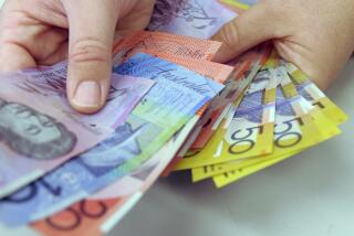
The color of money takes a fruity turn with new 20s
- Share via
From now on the new crisp $20 bills pumped out by the ATMs won’t be greenbacks anymore. They’ve been slid toward the pastel.
This move to stymie counterfeiters has spread among the populace a miasma of misgivings:
Has tradition been offended? Has tough old Andrew Jackson been coloristically insulted? Has the $20 bill, as widespread rumor has it, been turned into something pink?
“No, it’s not pink,” says Tom Ferguson, authoritatively. Ferguson directs the Bureau of Engraving and Printing. He also once ran its ACD program, whose initials stand for “anti-counterfeit deterrent.” He knows a lot about the 20s that his bureau prints.
“They’re not pink,” he says. “I don’t know where that came from. They’re peach.”
They’re sort of pistachio too, and blue.
But money, real money, ought to be a sturdy green. Oughtn’t it?
Not necessarily, responds Ferguson. The color of the money is really rather arbitrary. At the bureau there’s a rumor that the government started printing dark-green money in 1862 just because they had lots of dark-green ink.
That one color is just as good as another is a defensible contention. Unless, of course, one takes an aesthetic point of view. Red is the color of blood and heat. Blue is celestial. Green suggests -- well, one thing green suggests is cash.
Farmers looking at their crops sprouting in their fields see money in green shoots. Investors like green too. Money ought to grow. The emperors of China once wore complicated burial suits made of plaques of jade. Because it comes out of the ground, but is nonetheless unwithering, its color seems to promise eternal health and life. Green resonates.
And if green is obviously right, then peach is somehow wrong.
Peach feels sort of un-American. The last 10-ruble note printed by the Soviets was peach-colored. Ferguson must know this. He has one of those bills, with Lenin on it, in his outer office.
And peach is not, when you get right down to it, an entirely serious color. It’s too sweet, too flighty, too bruisable.
It feels French.
Which, one would think, would make it inappropriate for the $20 bill, which still depicts Andrew Jackson.
“Old Hickory” was the least exquisite of our presidents. He was born in a log cabin, not a chateau. He had a big scar on his face where he was cut by a sword (though this is not stressed on the 20, whose likeness is derived from the 1845 Thomas Sully portrait now in the National Gallery of Art).
And Jackson was rough. He thought horse-whipping his opponents, or caning them, a good idea. He carried in his body bullets from old duels. In 1829, during his now-infamous inaugural reception, a “rabble mob” of his supporters made a shambles of the White House. What Jackson was, wrote John Quincy Adams, was “a barbarian.”
Peach doesn’t seen right, either, for a double-sawbuck. (“Sawbuck,” an old term for a sawhorse, became a slang name for the $10 bill because of the roman numeral Xs once printed on its back, which were thought, by some, to resemble that device.)
Peach, one imagines, would be fine for Thomas Jefferson, who wore velvet slippers and danced minuets. Jackson wore muddy boots.
“The coloring is not a comment on Andrew Jackson,” says Tom Ferguson.
But in a way it is.
This cannot be helped. Colors carry messages.
Rising out of peach is an undeniable suggestion of the delicate, the soft, the rounded and the ripe. Luscious young lovelies are peachy, not crusty old soldiers. “Opinions differ about girls,” wrote P.G. Wodehouse. “One man’s peach ... is another man’s poison.”
Lots of other countries have lots of colors on their paper money. However, this does not provide much comfort. America’s folding money once looked ruggedly American. Not anymore.


