‘The Elder sign has turned California into an L’: An L.A. artist breaks down recall art
- Share via
The messaging meets you where you’re at.
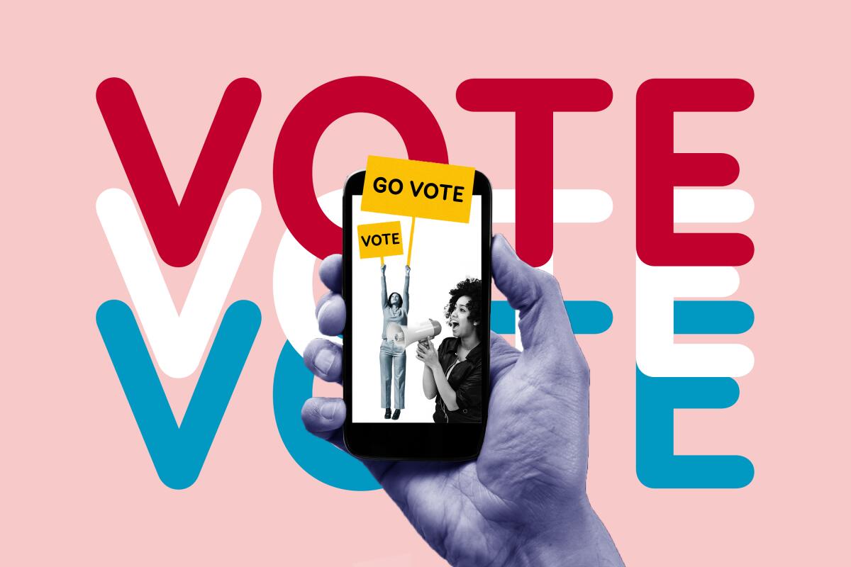
If you’re a millennial or zoomer, you’ve almost certainly seen the tweets, the IGs, the dating app messages and the social media posts encouraging, demanding or even begging you to get your ballot in.
“Friends don’t let friends skip elections,” reads one Instagram post from Sarah Epperson, an artist and illustrator from Los Angeles.
Some might say the best ads for the Sept. 14 recall election are on TV or on the radio. But the most shareable, informative and ubiquitous ads can be found online.
The examples are everywhere, with retro fonts and vibrant colors — red, white and blue, but also pink, yellow and green — that draw on the principles of graphic design. The art is visually appealing, youthful and trendy. It both summons the history of protest art and caters to the aesthetic demands of Instagram. There’s often an emphasis or appeal to diversity. The art is relatable, accessible.
It’s a continuation of the left-leaning style of activist art that exploded on the platform last summer. Now, those works are being used to encourage Californians to vote “no” on the recall.
Epperson has more than 78,000 followers on Instagram. For the last few weeks, she has been getting thousands of likes on her recall election art. She spent her 29th birthday last week nudging friends to vote.
“It’s actually been funny today, because I’m so focused on the recall, anytime someone texts me ‘Happy birthday, what are you doing?’ I’m like, ‘Did you send in your ballot?’” she said. A portion of the proceeds from the art she sells on Etsy go to relevant political groups.
Epperson is interested in making work that doesn’t fall into the trappings of less savvy, traditional political art. Take Republican Larry Elder’s political logo, for example.
“I just find it really interesting, from a design perspective, that the Elder sign has turned California into an L,” she said.
There’s a lot more to a shareable political piece than meets the eye. Epperson talked to The Times about what makes good political art in 2021.
Why Lizzo, Dua Lipa and others are crying on IG live
Q: How did you get into graphic design?
I’ve always been into art. Before I did art full time I was working in music. I would do flyers and things for events, or like DJs, because I was working in electronic music, which is kind of a left turn.
Q: What makes a good graphic? Something that’s shareable, but also gets the information across — what’s the secret?
I try and make things aesthetically vibrant, so that they would stand out, and also [be] accessible.
I think AOC has an amazing design team and she works with incredible artists that are local to her work. But so much of [the work you see from traditional political campaigns] is just black and dark and really scary.
Not everyone is having a Hot Vax Summer. Some daters are asking about vaccine status to gauge compatibility.
I want to inform people and let them know how high the stakes are, but my goal isn’t to scare people because everything is already so scary. Which is why I try and bring a lot of color and things into it. Because I think if I just let myself go, I would definitely fall down a hole of being like, “Oh, no, everything is too much.”
Q: The actual process of the recall is a bit complicated. How do you explain it in a way that’s also visually appealing?
I think I also rely on looking at what other people are doing, and then sometimes if it’s not what I imagined, or if it’s not something that makes sense to me, then I try and break it down in a way that does.
I always try to make sure that each slide could stand on its own if the person isn’t going to read the long caption or look at the other slides. With a recall, I broke it down into the main [graphic], then the reasons, the things that are on the line, what the ballot question looks like, different stats — also in the hopes that maybe there’s something for everyone. You might not be into rainbows, but you might be into polls.
Q: What was the inspiration behind some of the graphics?
I’ve used the rainbow gradient before. I really like how, like, bold and impactful it is. And I thought it would be nice especially to use it this time because it feels really California to me, kind of like the Monterey Pop/’70s fliers.
And the return your ballot one, I wanted it to feel very Californian. One of the major things on the line is the environment and our national parks, so I wanted it to feel kind of Big Sur-y because that’s just such an important thing.
Q: What’s your take on traditional campaign art?
It’s very prescribed and always stays in the boundaries. But there are people who are definitely doing it differently.
I don’t know if these things are really thought out. Sometimes it feels like art is always like the bottom rung. People are like, “Oh, yeah, that’s not hard, and it doesn’t matter.” I don’t know, that’s just something that I’ve been noticing. I think that a lot more campaigns could add more color and things like that, that would be exciting.
More to Read
Sign up for The Wild
We’ll help you find the best places to hike, bike and run, as well as the perfect silent spots for meditation and yoga.
You may occasionally receive promotional content from the Los Angeles Times.
