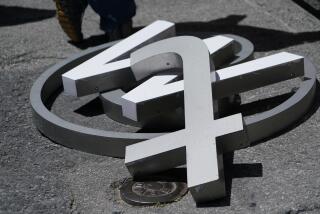
London’s 2012 Olympic logo elicits fits and anger
- Share via
LONDON — Officials for the 2012 Summer Olympics here were looking to make a splash with their new logo for the London Games, and they surely did.
Within two days of the bright, geometric design’s unveiling this week, there were 48,000 signatures on a petition to dump the logo immediately. A motion floating in Parliament called it a “childish, ridiculous and pathetic attempt to appear trendy.” And London Mayor Ken Livingstone piled on by midweek, pronouncing the new symbol a “catastrophic mistake.”
Then there was the video designed to showcase the new logo, which did make a splash, all right. It featured an animated image of a diver whose entry into the water sent out ripples of sparkling, flashing lights. The image triggered epileptic seizures in at least 23 people across Britain who watched the video on television.
Many other epilepsy sufferers, and who knows how many other Britons from the sound of it, were made ill.
“There were a lot of people who experienced headaches, nausea, vomiting, migraines,” said Ingrid Burns, a spokeswoman for Epilepsy Action, who said the London Olympic Committee violated broadcasting standards against flashing and flickering lights designed to protect photosensitive epilepsy sufferers.
London Olympic Committee officials immediately removed the offending video from the committee’s website. They say the logo’s design, which features the numbers 2-0-1-2 as graffiti-like cutouts in movable settings with changeable bright colors, was never intended to be traditionally pleasing.
“We’ve always said it was going to be very different from what had gone before. We always said it was a bold logo because it was going to be a bold Games. It was a brave logo because we wanted it to be a brave endeavor,” said Joanna Manning-Cooper, committee spokeswoman.
The design, created by international brand consultants Wolff Olins, was targeted in part to appeal to young people, whose reengagement with sports is one of the chief goals of the London organizers. It is a “digital media era” design specifically intended to work across different media platforms, Manning-Cooper said.
“Yes, there has been a reaction to it. But the logo has been designed to be flexible, we said that from day one, and it will evolve over time.”
Perhaps in the hope of giving evolution a nudge, newspapers this week have been full of alternative logo designs sent in by the public: nice, clean, somewhat-traditional insignias that feature images like Big Ben, St. Paul’s Cathedral and the London Underground symbol intertwined with the words London and 2012.
As for the public’s reviews on the Olympic Committee’s attempt, all but a very few have been dismissive, or worse. “It must be agonizing as a graphic designer to make your mark on the world by creating the ugliest example of futility in the history of the world,” one reader wrote to the Daily Mail.
“Wow, that’s some ugly logo,” said another, more sanguine subscriber.
Noting that previous Olympics logos also have met with initial hostility, Olympic officials say they are determined to press on. By week’s end, they appeared to be winning the battle: The petition to scrap the symbol was quietly abandoned, apparently after its organizers began to worry the effort would threaten sponsorship for the Games.
“We don’t do bland. This is not a bland city,” declared London 2012 Chairman Sebastian Coe, a four-time Olympic medalist and Conservative politician. “We weren’t going to come to you with a dull or dry corporate logo that will appear on a polo shirt we’re all gardening in in a year’s time. This is something that’s got to live for the next five years.”
Preferably, he might have added, not in infamy.
--
More to Read
Go beyond the scoreboard
Get the latest on L.A.'s teams in the daily Sports Report newsletter.
You may occasionally receive promotional content from the Los Angeles Times.


