Sign up for The Envelope
Get exclusive awards season news, in-depth interviews and columnist Glenn Whipp’s must-read analysis straight to your inbox.
You may occasionally receive promotional content from the Los Angeles Times.
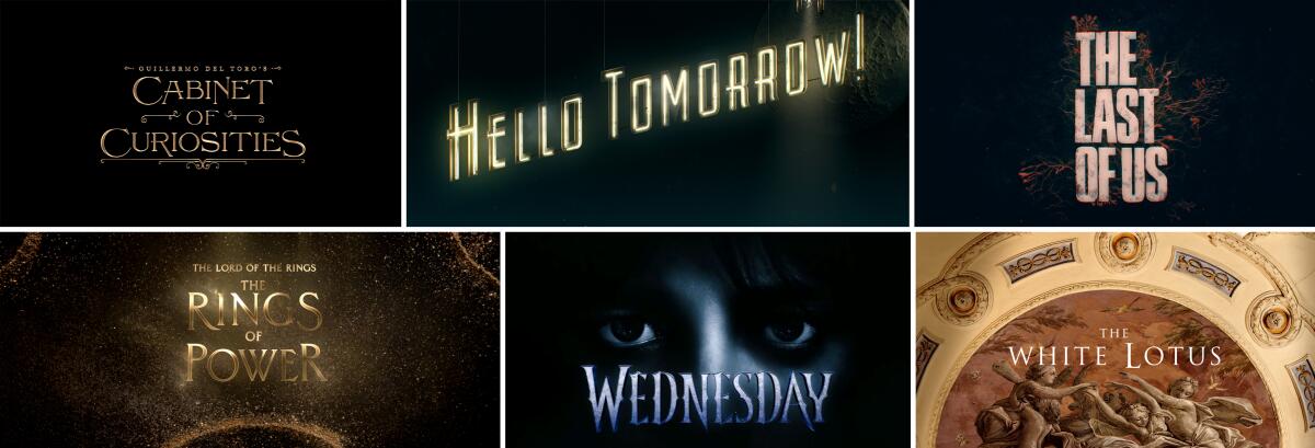
When it comes to this year’s crop of main title Emmy nominees, you might want to reconsider selecting the “skip intro” feature on your device. The creative teams behind each offer an entry point into these scripted worlds through a dynamic tapestry of striking imagery, bespoke titles and complementary score. This season’s standouts are “Guillermo del Toro’s Cabinet of Curiosities,” “Hello Tomorrow!” “The Last of Us,” “The Lord of the Rings: The Rings of Power,” “Wednesday” and “The White Lotus.”
Alone, they are captivating abstract films more appealing than anything you’d find on a social media reel. But connected to their series, their artistry subliminally sinks you into the tenor, tone and veracity of the story, leaving you wanting to see more. Here the six nominees detail the inspiration and techniques involved in making such alluring sequences.
Company: The Mill Creative
Directors: Chet Hirsch, Mike Schaeffer
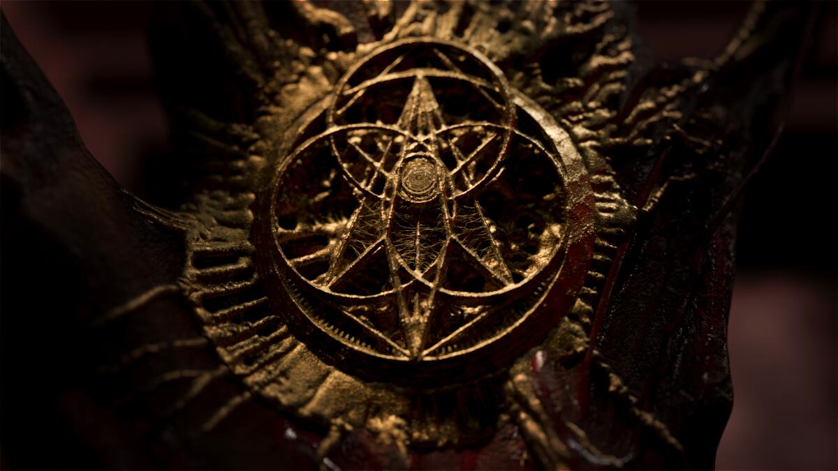
“I think Guillermo del Toro is the most generous director there is in terms of sharing his influences,” says Chet Hirsch of the Mill, the studio behind creating the main title to “Guillermo del Toro’s Cabinet of Curiosities.” ”He shared journals, films and history of actual cabinets of curiosities, so immediately the concept became much larger.” Hirsch, along with Mill creative director Mike Schaeffer, channeled those ideas to conjure a beautifully sinister journey through a cabinet of creatures, oddities and mystical arts.
The storyboarded sequence sees doors fly open and the cabinetry consuming the viewer to reveal a three-headed haunted mask, a creepy game-playing automaton, a spiraling image of human bones, a ghastly mermaid, a mummified hand and an abstracted clock unwinding itself. The twisted world ends on a spine of books contained within.
Motivating the imagery was the spiraling motion throughout. “Del Toro loves the Haunted Mansion ride at Disneyland, so we started thinking about this journey as a ride. But we were conscious of creating a beginning, middle and end where the stakes increased as we went,” Hirsch says. A shifting sense of scale and powerlessness grows within the hallways. “The camera moves are a little disorienting, but that was adding to the feeling that you’re trapped,” Schaeffer adds. Even the title lettering of the Netflix anthology series echoes the macabre and was inspired by writing manuals from the 1500s. Del Toro, Schaeffer says, “listened, and he added and corrected where necessary. And that was from the very beginning. It was exciting to experiment with him.”
Favorite title design: Hirsch — “The Dunwich Horror” (1970); Schaeffer — All of James Bond
Company: Imaginary Forces
Creative director: Ronnie Koff
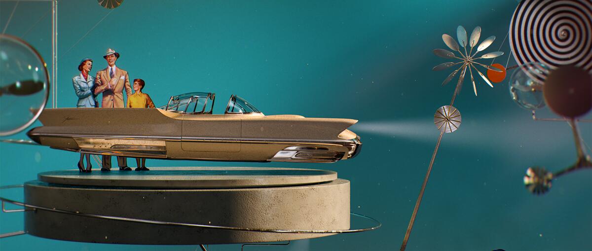
For the Apple TV+ series that colonized the moon circa 1950, designers at Imaginary Forces created a retro-futuristic timeline of invention. The vibrant sequence is dripping in period nostalgia with a sci-fi twist, and visuals unravel through a single upward camera move — a subliminal nod imitating the path of flight. Against a tantalizing teal backdrop, household items and inventions evolve — from a refrigerator to a flying car — before a rocket ship takes off, revealing the “Hello Tomorrow!” title card and a full moon. Influence was taken from advertisements of the era and famed industrial designers Charles and Ray Eames. But there’s something not quite right about the story that has Billy Crudup (“The Morning Show”) and his cohorts selling time-shares to the lunar orb.
“You’ll notice in the title sequence there are all these spinning parts. Little circles, flowers and a black-and-white spiral,” says creative director Ronnie Koff. “We wanted to convey this sense of mysterious salesmanship that looks pleasant, but there’s an underlying story that isn’t quite so cheery. Those spinning parts are a reference to being mesmerized, conveying that this is a fantasy and you are being put in a trance.” Subtle scratches and fingerprints on the contraptions add to the door-to-door salesman aesthetic, making it feel touched. A rising musical piece stirs the uneasiness. “We wanted it to feel like a display showcase that a salesman would take with them. It would be a little beaten and have a sense of imperfection to it,” notes Koff. “We animated little glitches in the sequence to make it rigged and for it to have flaws as well.”
Favorite title design: “Wimbledon” (2004)
Company: Elastic
Creative directors: Nadia Tzuo, Andy Hall
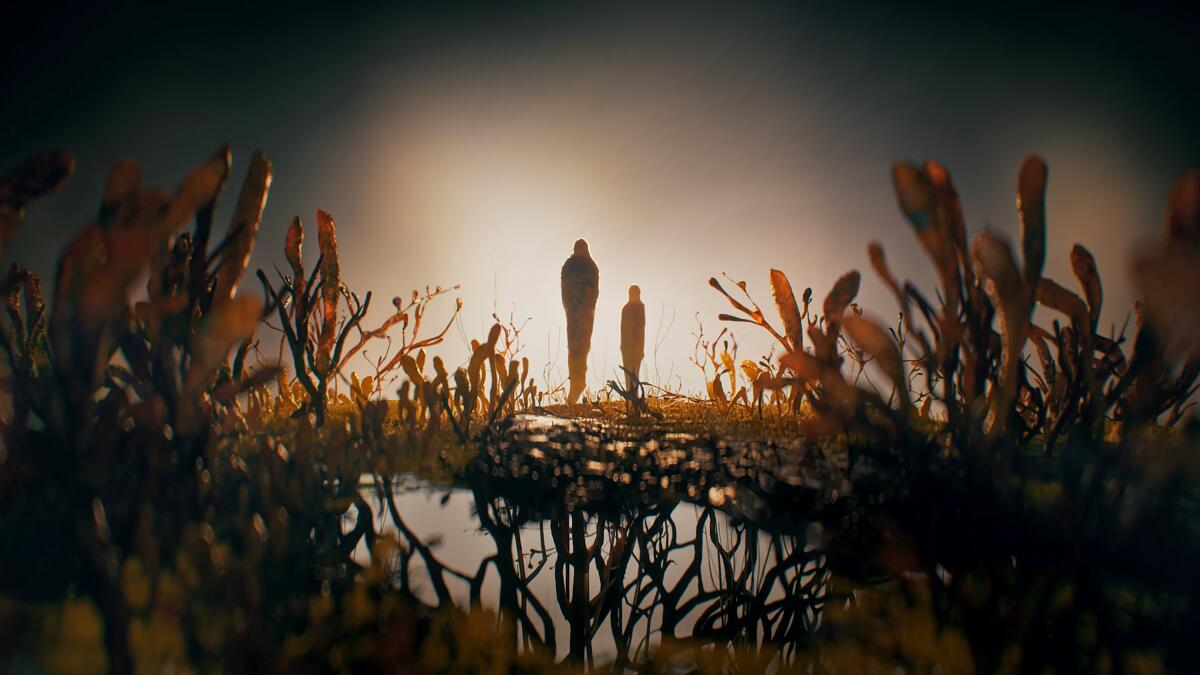
Like the series itself, the opening credits to HBO’s “The Last of Us” had to evolve beyond the 2013 video game it’s based on. In the show, created by Neil Druckmann and Craig Mazin, a fungal parasite has created a postapocalyptic world where zombie-like infected humans feed on those who remain. The main title acts as a tonal seed to the lethal outbreak. Its imagery begins with a sneaky crawl of spreading fungi before transforming into subliminal shapes of a cityscape, a map of the United States and a human face. It ends on two taller fungi figures resembling Joel (Pedro Pascal) and Ellie (Bella Ramsey), the heroes undertaking a tumultuous journey.
Elastic creative directors Nadia Tzuo and Andy Hall extensively researched fungi species to plant different languages in the visual storytelling. “We didn’t rely on a single type of fungus,” Tzuo says. “The variety allowed us to create all these different shapes and change how it grows.” The team also considered the emotional beats within the accompanying music and changed the behavior of the spreading fungi to be more or less aggressive accordingly. “The pacing of the music and tone of it has a big impact on what we do,” Tzuo notes. Hall adds, “It had an intention to it. It’s a very complex system, and we wanted to capture that, even though the fungi is manifesting and speaking to the storytelling.” Color also influenced how visuals appear on screen, with orange being a focus because of its alerting nature. The end result is an evolving poetic journey that Hall says feels tangible and real.
Favorite title design: Tzuo — “Carnivale”; Hall — “The Sopranos”
Company: Plains of Yonder
Creative directors: Katrina Crawford, Mark Bashore
“Tolkien’s world is so rich you have people who know it well and others who are going to be watching for the first time. That was a beautiful puzzle to be presented with, so we had to show these big themes in a way that also feels epic,” says Plains of Yonder creative director Katrina Crawford, who worked alongside Mark Bashore. Both are double nominees for “The Lord of the Rings: The Rings of Power” and “The White Lotus.”
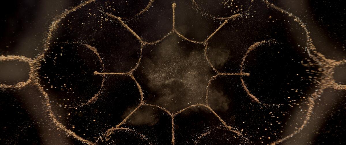
In designing Prime Video’s “The Rings of Power,” ideas of creation, magic, time and space were woven into the imagery. “Tolkien wrote a creation myth, and his creation myth has to do with sound. That led to us using cymatics,” notes Crawford. “The phenomenon feels completely magical when you watch it and do it practically.” The science is the connection between sound and vibration. Consider it like the scene in “Jurassic Park” where the cup of water starts to shake and we see ripples in the liquid as T. rex gets closer.
Instead of water, the team used sand to form cymatic patterns on different metal plates. Two practical rigs were built from scratch: one to produce the specific iconography layered in the titles, the other to push boundaries. A kaleidoscope of rings, trees and shapes traverse a black plain, hinting at an ancient and timeless world. Each shot gives a sense of time and space. Visuals combined practical and CG elements for its finish. “We composited the flawed live-action material on top of the CG,” Bashore says. “Cymatics is quick and wild and not as graceful as what a computer would make. Our goal was to make it feel like you don’t know how it’s made or what you’re looking at.”
Favorite title design: Crawford — “Gilligan’s Island”; Bashore — “Hawaii Five-0”
Company: Filmograph
Creative director: Aaron Becker
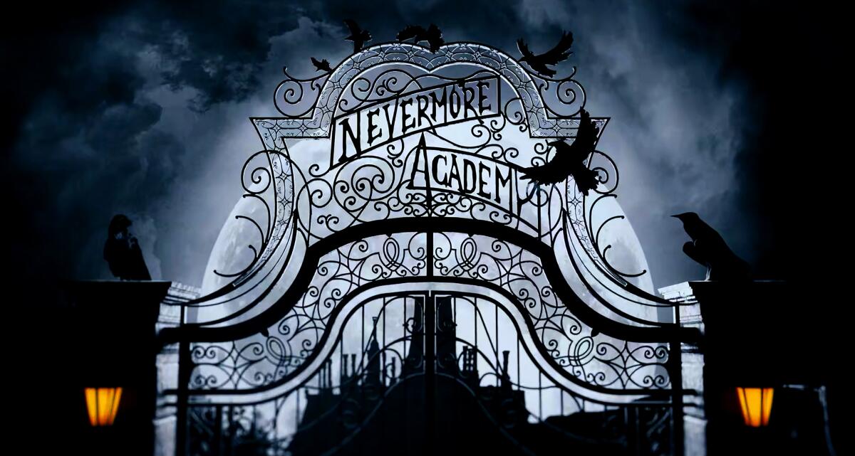
In spinning a new kooky Addams Family tale, title designers explored the mind of its morbidly dark title character. The imagery, informed by the production design of the Netflix series, takes viewers on a spiraling visual journey that begins with Wednesday Addams (Jenna Ortega) staring at the opening gates of Nevermore Academy. A typewriter, book and violin begin to fall into a seemingly black abyss. A clock melts into a staircase opening up to the stained-glass window found in the dorm room Wednesday shares with the colorful Enid Sinclair (Emma Myers). A tree is struck by lightning in a graveyard that’s inside a crystal ball. A venus flytrap morphs into a flower before Wednesday’s eyes emerge from the moon and clouds. It’s a haunt of the fright to come. “Everything in between the first and last shot is diving into her psychology. A perfect storm of what’s inside her mind that I would call a dreamscape, but it’s more of a nightmare-scape,” says creative director Aaron Becker of Filmograph.
Collaborating with director Tim Burton, the creative team first considered the shot of Wednesday’s eyes and then reverse-engineered the sequence. The coiling composition grounded the visual building blocks and movement. The biggest hurdle was connecting the spiraling clock to a staircase that the severed hand Thing can be seen walking on. Filmograph incorporated elements to “expand the world” while peppering in Easter eggs. The color palette blows kisses of violet, fire and lens flares. “We layered in these accents of color to give a momentary feeling that it’s not all bad,” notes Becker.
Favorite title design: “Bad Sisters,” “Godfather of Harlem”
Company: Plains of Yonder
Creative directors: Katrina Crawford, Mark Bashore
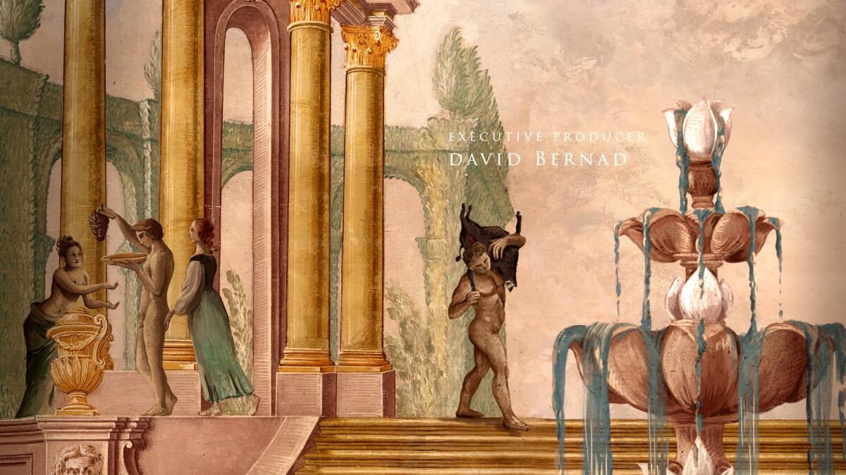
The main titles for the second season of HBO’s “The White Lotus” took established themes and a visual style even further, with creative directors Katrina Crawford and Mark Bashore enriching a painterly story of romance, lust and sin. “We wanted to make it significantly different,” Bashore says. Show creator “Mike White had shot scenes at a villa and was struck by the art on the walls. Those images became a base to work from.”
The Plains of Yonder team looked at 16th century art and trompe l’oeil paintings to establish the imaginative visuals that mix the “sacred with the profane.” A stirring three-act musical piece helped to guide a gallery of fresco paintings as a moving camera reveals more than meets the eye. “Mike described the season as more operatic,” says Crawford about the interpersonal drama of Season 2 that takes place in Sicily. “And because his stories are so rich and detailed, kind of like a whodunit where you are looking for clues, we wanted to continue the metaphor of what you see isn’t exactly what it is. There is something else underneath.”
Actor title cards provide clues about their characters. Jennifer Coolidge’s credit depicts a chained monkey, representing being trapped. There’s a boy with a faithful dog by his side as he swoons over a lady appearing next to Adam DiMarco. The card for Sabrina Impacciatore shows a woman pointing at two females, a hint about the character’s sexuality. A cat holding a bird in its mouth portrays Simona Tabasco’s character, suggesting a beautiful predator doing what she has to do to survive. “Since this show is a satire, it’s important you’re leaving clues,” Crawford notes. “I think each time you watch it, you can notice new things.”
Sign up for The Envelope
Get exclusive awards season news, in-depth interviews and columnist Glenn Whipp’s must-read analysis straight to your inbox.
You may occasionally receive promotional content from the Los Angeles Times.