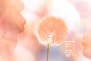
Pantone’s Color of the Year for 2019 is ‘life-affirming’ Living Coral
- Share via
In an ironic twist, Pantone’s nature-inspired Color of the Year for 2019 — Living Coral — was announced on the same day of news that global emissions of carbon dioxide have reached the highest levels on record.
Every year since 2000, the Pantone Color Institute has unveiled a hue that tries to capture the collective mood of the country, influencing what consumers will soon see in home decor, fashion and beauty and product design.
Is this year’s color a commentary on climate change?
According to the Color Institute, Living Coral “emits the desired, familiar, and energizing aspects of color found in nature.”
“As a shade that affirms life through a dual role of energizing and nourishing, Pantone 16-1546 Living Coral reinforces how colors can embody our collective experience and reflect what is taking place in our global culture at a moment in time,” Pantone Vice President Laurie Pressman said in a statement.
Pantone also offered an optimistic spin.
“With everything that’s going on today, we’re looking for those humanizing qualities because we’re seeing online life dehumanizing a lot of things,” Pressman told the Associated Press. “We’re looking toward those colors that bring nourishment and the comfort and familiarity that make us feel good. It’s not too heavy. We want to play. We want to be uplifted.”
Other than the yearly announcement, why does Pantone’s annual choice matter?
“These announcements have such a far reach and a big impact,” said color specialist Martin Kesselman, who has served as a brand ambassador to Farrow & Ball, Benjamin Moore and Fine Paints of Europe. “Creatives and enthusiasts alike are connected on social media, paying close attention to what’s being placed and where. Everyone has access to it. They are watching the trends unfold locally and globally in real time on their Instagram feeds. It sets the tone for the landscape, the bulk of the work out there. The influencers, in this case influential brand Pantone, have a large role and I feel responsibly to put out good product [color]. It’s a game of follow the leader. I’m conscious of it and the idea is to deliver not only good, but thoughtful color creations, choices, schemes and designs.”
Pantone’s year of thoughtful color analysis also translates to a welcome dose of fun for 2019. Expect to see rugs, couches, lamps and accessories in “life-affirming” coral tones.
“The Color of the Year is a perfect example of how we can find beauty in all living things and that there are a lot of vibrant colors in nature,” said Lamps Plus interior designer Erica Islas. “These jewel tones are nature’s gifts.”
She offered these tips for making it work in your home:
“This color works well with other jewel tones like teal and navy — and it’s perfect with taupes, grays and beiges as well because it has a golden undertone. Although it’s a feminine color, the Color of the Year is stunning when combined with navy, making it more masculine if used as an accent.”
ALSO:
Global-Warming White, Offred Red and other 2019 Pantone Color of the Year picks that never were
Pantone’s Color of the Year for 2018 is a Princely purple
How, exactly, does a ‘Color of the Year’ get chosen?
More Southern California home tours


