Yeah, We Designed That
- Share via
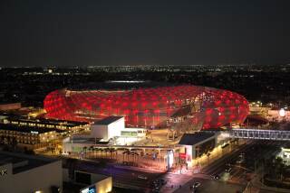
The Staples Center logo unveiled last week is actually a logo within a logo.
Staples Inc., the Massachusetts-based office products chain that reportedly paid $100 million for naming rights at the basketball and hockey arena scheduled to open in downtown Los Angeles in the fall of 1999, got top billing in the logo designed by Boardwalk, a Glendale-based design firm.
The logo, which features a big-city skyline, searchlights and stars, also incorporates a stylized version of the arena’s signature architectural element: a rooftop “beacon” that borrows heavily from a ‘50s-era automobile tail fin.
This past summer, the arena’s developers issued what Kevin Walker, one of Boardwalk’s owners, described as “three prime directives:” Include Staples’ red corporate logo, incorporate some element of the arena’s architecture, and play upon the excitement the arena is expected to add to downtown Los Angeles’ night life.
Early renderings featured cartoon-like buildings, a palm tree and stars that were encompassed by an arena. As Boardwalk worked through hundreds of design changes the arena took on a cleaner, rectangular design. Boardwalk co-owners Harriet Baba Breitborde and Walker hit upon the logo’s highly stylized cityscape after studying real-world and comic-book skylines.
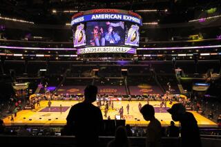
Boardwalk incorporated purple and black from the uniforms worn by the Los Angeles Kings and Lakers, the pro teams that will play in the arena.
More to Read
Inside the business of entertainment
The Wide Shot brings you news, analysis and insights on everything from streaming wars to production — and what it all means for the future.
You may occasionally receive promotional content from the Los Angeles Times.


