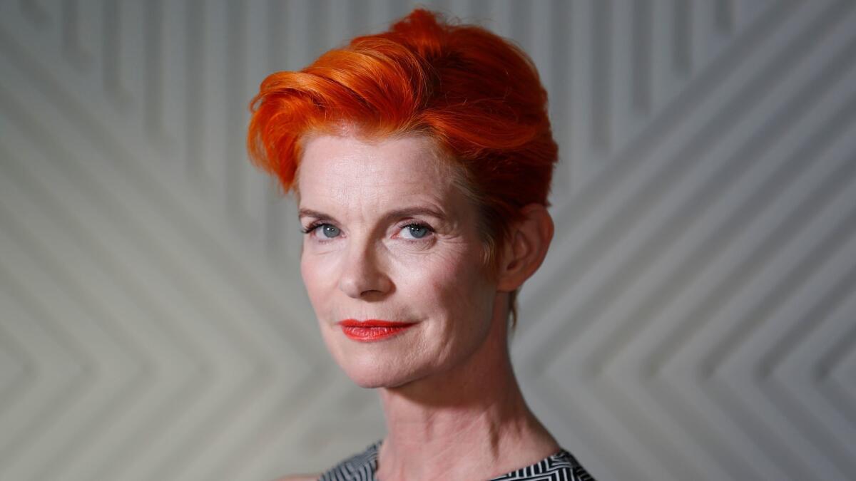
‘Wonderstruck’ costume designer Sandy Powell sheds light on working in black and white

- Share via
To understand the challenges facing “Wonderstruck” costume designer Sandy Powell, take a photo of something complex and colorful, say, a crowded city street, and then make it look cinematic in black and white. Is it dull? Hard to distinguish textures?
The three-time Oscar winner (“Shakespeare in Love,” “The Aviator” and “The Young Victoria”) found a solution in the palm of her hand when making costumes for the film, half of which was shot in black and white. Powell applied a black-and-white filter to to her iPhone when snapping images of those costumes.
That kind of creative problem-solving may be partly why she won those three Oscars and earned an additional nine nominations, including two in 2016 for “Carol” and “Cinderella,” and earlier ones for “Gangs of New York,” “Velvet Goldmine” and “Hugo.”
WATCH: Video Q&A’s from this season’s hottest contenders »
Like “Hugo,” “Wonderstruck” is based on a complex graphic novel by Brian Selznick telling the story of two deaf runaways, Rose and Ben, in two eras and two aesthetics: a black-and-white, silent movie feel for Rose in 1927, and a gritty, colorful 1977 with a full soundtrack for Ben.
Powell reunited with several frequent collaborators, including director Todd Haynes, cinematographer Ed Lachman and “Wonderstruck” author Selznick.
She takes us inside her process in a recent conversation.
You’re an executive producer on “Wonderstruck.” How did that come about?
It happened quite naturally. I met Brian while we were shooting “Hugo.” During a visit to L.A., I visited him in San Diego … and grabbed “Wonderstruck” off the shelf and read it in one sitting. I said to Brian that it should be a film and he should write the screenplay. I gave it to Todd and talked to him about doing the film.
You had the script that Selznick wrote, but did you also rely on his graphic novel for reference?
For costumes, not so much, funnily enough. For the older Rose character, I didn’t do anything like the illustration in the book. Brian wasn’t offended because he had already gone through that with me on “Hugo.”
Illustrations don’t necessarily work on camera. The other thing to remember is that when Brian writes his books, he’s come up with what they wear based on what he thinks the characters look like. When we cast a film, you may get a kid who doesn’t look like the kid in the drawing, so they shouldn’t wear what the kid in the drawing is wearing.
Millicent Simmonds, who plays Rose, is deaf. Had you ever worked with deaf actors before?
Never. We did all learn some very basic sign language. You also just learn to look at somebody and gesticulate a lot, which I tend to do anyway. You can actually mime or talk, and most of the time there would be an interpreter there.
I think what made it really great is that there is so much expression going on. Deaf people have such fantastic facial expressions and ways of communicating that it was infectious; it spread among the crew.
In the absence of dialogue during portions of the film, did you feel you had to provide more richness or texture to the costumes, particularly since they were in black and white?
Not so much because there was no dialogue but because it was shot in black and white, which I hadn’t done before. It is a very different process from when you are dealing with color. In addition to color, I had to look at texture and contrast. I find color very, very important and I will often start off with color before I know what people are wearing.
How did you teach yourself to “see” in black and white?
I would put something together that I thought looked great and photograph it in black and white, and, oh, it looks dull, bland. There was trial and error. I also photographed fabric during construction. I spoke to Ed [Lachman, director of photography] about this, and he wanted extreme contrast —deep blacks, clear whites and definite differences in tones. Plaid helped.
So if we saw the 1920s set in real life, would it look black and white?
Even though I knew I was working in black and white, I couldn’t help myself from putting things together with colors that I thought worked. I wanted it to look nice to the eye and for behind-the-scenes photos. Maybe I made a little bit more work for myself.
More to Read
Sign up for The Envelope
Get exclusive awards season news, in-depth interviews and columnist Glenn Whipp’s must-read analysis straight to your inbox.
You may occasionally receive promotional content from the Los Angeles Times.


