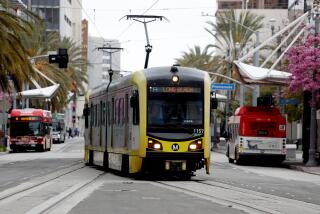
Review: Lackluster Expo Line reflects Metro’s weak grasp of design
- Share via
This is getting to be a pattern. Every time a major rail line opens in Los Angeles, my reaction tends to unfold in two distinct parts: excitement tempered pretty quickly by a sense of disappointment, of opportunities missed.
The $930-million Expo Line is the latest example.
The excitement flows from the way new transit lines are remaking — genuinely, thoroughly remaking — the civic, cultural and architectural map of Los Angeles. Running south and then bending west from downtown, skirting the campuses of L.A. Trade Tech and USC before reaching the corner of Jefferson and La Cienega boulevards, the Expo Line’s first phase, with its eight stops, has brought the city’s light-rail network to the doorstep of the dense Westside.
Expo Line 360°: La Cienega/Jefferson station | Expo Park/USC station
When two more stations open over the summer, the line will cover a total of 8.6 miles. It will add Culver City, incubator in recent years of art galleries and ambitious restaurants, to a light-rail and subway system that already ranges north to the San Fernando Valley, south to Long Beach and east to Sierra Madre. A final phase will extend the Expo Line west to Santa Monica by 2015 or early 2016, delivering riders within a few blocks of the beach.
The architecture of the new stations, unfortunately, is not just weak but somehow aggressively banal.
If that strikes you as a contradiction in terms, you’re right. The stations seemingly want to disappear into the cityscape and at the same time assert a Big Metaphorical Idea about what public transit means for Los Angeles. And in trying to do both, of course, they do neither.
Designed primarily by Roland Genick, chief architect for rail and transit systems at Parsons, the huge Pasadena-based construction conglomerate, the new stations are topped by undulating light-blue canopies of perforated metal panels that are not only dated — bringing a public-art project from the early 1990s to mind — but provide almost no shade or rain protection. Or solar power, for that matter, though from certain angles the stations look a bit like they’re covered with photovoltaic panels.
The canopies are meant to suggest a woven pattern, symbolic of the way new Metro routes, and the Expo Line in particular, are knitting parts of the city together. (Their design is a modified version of an idea first developed by L.A. artist Cliff Garten in 2004.) Gruen Associates and Miyamoto International also contributed to station design, along with Jorge J. Pardo, the Metropolitan Transportation Authority’s director of creative services.
In concept, the weaving idea is perfectly inoffensive. In execution, it has grown into a sort of ornamental kudzu. It overwhelms the rest of the station architecture, which is generally understated, even minimalist, and the impressive landscape design (also, according to Genick, handled by Parsons) that helps connect the line to the surrounding city.
In fact, with the exception of the stretch where the line runs near USC — and more on that later — the Expo Line almost melts into the neighborhoods it cuts through, maintaining a low-slung profile. Three stations near the western end of the line’s first phase are elevated, but the others, at street level, are split in half as they straddle major intersections. It’s as if each stop is two miniature stations.
That modest scale is a concession to the density of many neighborhoods the new line runs through. But it’s also an effective design gesture, a reminder that many of the most impressive stations in the Metro rail network — think of the Mission stop on the Gold Line — are also the simplest.
The crux of the problem is that Metro never managed to clarify its architectural goals for the Expo Line. A sleek, restrained design strategy, focusing on details and stressing above all a seamless transition from station to neighborhood, might have worked here. So might a more ambitious, design-first kind of architecture.
To be fair, the new stations represent a modest improvement over those on the 2009 Gold Line extension. They’re appreciably better than the underground stations on the Red Line, which started service in 1993. Metro has finally abandoned the idea that every rail station ought to be uniquely designed to reflect the demographics of the immediate neighborhood. That approach, employed on the Gold and Red lines, was a misstep architecturally and a disaster in terms of maintenance, since each station has to be cleaned differently, its materials aging and breaking down at a different pace.
But saying that the new stations aren’t quite as bad as the older ones isn’t saying much at all. When it comes to architecture, Metro has set a very low bar.
As I wrote last week about its new master-planning effort for the area around Union Station, Metro seems to be facing an internal divide about how enthusiastically it wants to pursue strong architecture. Its decision to present so-called Vision Boards showing Union Station as it might exist in 2050 was a way, essentially, to postpone that argument, to exile adventurous architecture to a far-off, futuristic world.
Thanks to the Measure R tax hike, however, Metro stands to be the most important patron of public architecture and urban design in Southern California for the next 10 or even 20 years. That’s why the middling design of the stations is more than a minor issue: because Metro has become and will continue to be a major force in shaping the public identity of 21st century Los Angeles.
As it plans future stations, Metro should begin pairing transit specialists like Parsons with architects who can bring a new level of sophistication to the task. That would be a first step in banishing for good the idea that impressive station architecture is a luxury that Metro — and by extension L.A. — can’t afford. If Metro had used a single highly ambitious design template for the Red and Gold lines, after all, it would have saved money and improved the level of architecture.
Video: A quick ride on the Expo Line
The bigger obstacles, frankly, seem to be bureaucracy and control. Metro makes it tough for smaller firms to get a crack at its contracts, and worries not so much that talented architects are expensive, though that is an issue, but that they will prove insufficiently pliable or willing to compromise their designs.
Speaking of which, it’s time for Metro to show some backbone of its own when it comes to urban design. For nearly all its length, the Expo Line — thanks again to the 2004 Garten plan — is conceived as a “transit parkway.” Thickly planted but drought-tolerant landscaping provides the ground cover. Flowering vines grow up and over restrained green fencing. A bike lane runs parallel to the tracks along much of the line.
The idea has its roots in concepts laid out in “Parks, Playgrounds and Beaches for the Los Angeles Region,” a 1930 plan by the landscape firms Olmsted Bros. and Harland Bartholomew that was famously never executed.
Expo Line 360°: Expo Park/USC station | La Cienega/Jefferson station
But USC officials, Genick told me, pushed Metro to change the design along the edge of campus. In those sections the drought-tolerant plants are replaced by stretches of lawn, the fencing is black and more prominent and is accompanied by long stretches of red brick.
The brick is largely an attempt to satisfy USC’s interest in having the new line, as it runs near the campus, match the architecture of the university. But the change undermines the coherence and design personality of the line as a whole, exchanging the subtleties of the parkway design for something a lot more lumbering and conspicuous. And it comes at a point in the line that is otherwise one of the most thrilling, with its close-up views of Exposition Park and the Natural History Museum’s newly expanded garden.
When you consider the light-blue canopies and the brick as elements of a common design strategy, or at least of a single bureaucratic personality, a dispiriting portrait of Metro emerges.
It shows a transit agency still very much adrift when it comes to architecture and design — both in terms of the stations it commissions and the concessions it’s willing to make.
christopher.hawthorne@latimes.com
More to Read
The biggest entertainment stories
Get our big stories about Hollywood, film, television, music, arts, culture and more right in your inbox as soon as they publish.
You may occasionally receive promotional content from the Los Angeles Times.


