ARCHITECTURE : Center West Building on Wilshire Is Just Another Boxy Monstrosity
- Share via
Westwood’s Center West building, a sleek, planar structure with a skin of deep red granite, appears to be blushing. And those who have lived in the area for a while know the source of its shame: It displaced one of the finest examples of “Googies Architecture” ever to have graced Los Angeles. Long before Center West was ever conceived, the site was home to an exuberant celebration of fast food and modern living known to generations of UCLA students as Ship’s.
Ship’s was torn down to make room for the almost 300,000 square feet of office space that make up this building. Despite having an impossible act to follow, the New York architecture firm of Mitchell/Giurgola gave it a try.
Center West looks best from the direction from which it takes its name. From the nearby San Diego Freeway, all you see is a plane that steps up to the south so that it appears to be sailing off in that direction. A recessed colonnade near the top and the massing of the building, which steps away from the corner of Wilshire Boulevard and Glendon Avenue, help the sense of movement. The final touch that gives the building a sense of grace is the appearance of thin strips of glass and steel window wall at the southern edges. It is as if the whole building is undressing itself, in the process revealing an elegant and light corset below its ponderous facade. You can get a little of the same feeling when you come down Wilshire from the east, although from there the sheer mass of the tower tends to overwhelm its delicate edges.
The building continues to play between pompous monumentality and tantalizing planar shapes on the street as well. The Wilshire facade comes down on cutout columns, but the corner that turns toward Westwood is a complicated game of stepping shapes that successfully resolves the facade’s strange angles into the sweep of the main boulevard. The pieces that the architects added on to the rear and the east side of the lot contain unrented retail spaces and a gigantic parking entrance.
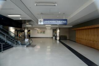
The lobby spaces regain the corporate elegance of the west face. A below-grade atrium, filled with stairs spilling into it and site-specific artwork, helps create a smooth transition between the parking elevators, the various street entrances and the elevator blocks at the core of the building. White and green marble surrounds the various structural components of the building, so you can feel both the massiveness of the structure and its corporate quality. You can inhabit the base of Center West, winding your way through spaces that integrate the scale of the street with that of this private development.
A great deal of thought obviously went into the design of this building. Unfortunately, your eye tends to glide over all the sophistication, and what you see instead is its similarity in size and color to other buildings on Wilshire Boulevard. Developers like granite (it makes the building look solid and classy) and in this case various neighborhood groups wanted the building to be low on the side facing Westwood. What resulted was a building that, almost two years after its completion, appears to be largely empty and oppressive.
And the lack of integration between the base and the top of the building with its dreadful, glittery red granite makes the building just another dumb box in a landscape filled with such functional monstrosities.
If only this building could have expressed its structure, its material, its character and even its history, it might have worked better. A little bit of honesty goes a long way, even in architecture.
More to Read
The biggest entertainment stories
Get our big stories about Hollywood, film, television, music, arts, culture and more right in your inbox as soon as they publish.
You may occasionally receive promotional content from the Los Angeles Times.


