Why awards season’s biggest movies switch between black and white and color
- Share via
When Martin Scorsese decided to include old-fashioned movie-house newsreels in his new film, “Killers of the Flower Moon” (Apple TV+), he and cinematographer Rodrigo Prieto knew they’d be shot in black and white. Of course, color wasn’t a realistic option for movies in the 1920s, when the film takes place. But when you work with a devoted cinephile like Scorsese, it turns out it’s easy to get your hands on the right camera: The director had the perfect 1917 Bell and Howell hand-crank camera — in his very own living room.
“We took it to Panavision and had it oiled and fixed to be in mint condition, and what you see in the film is the exact image from that camera,” says Prieto, who worked with second unit director Ellen Kuras and DP Darren Lew for those scenes. “Using this black and white representation of the Osage is interesting, because later in the movie we see the full-color version of their lives.”
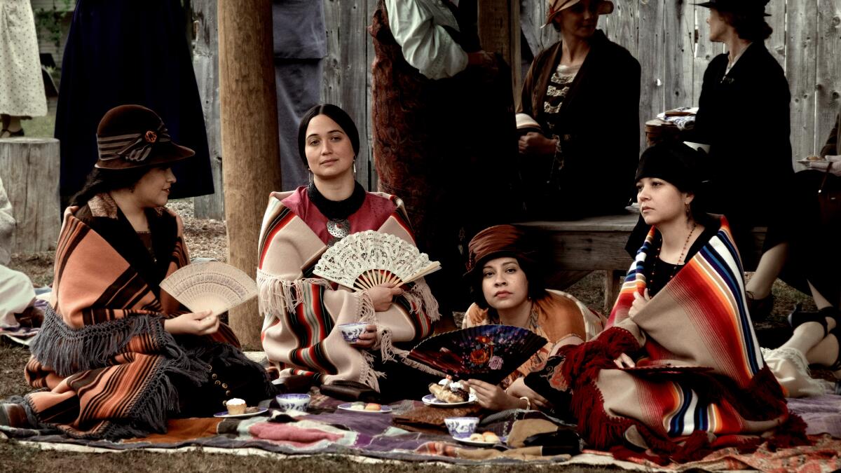
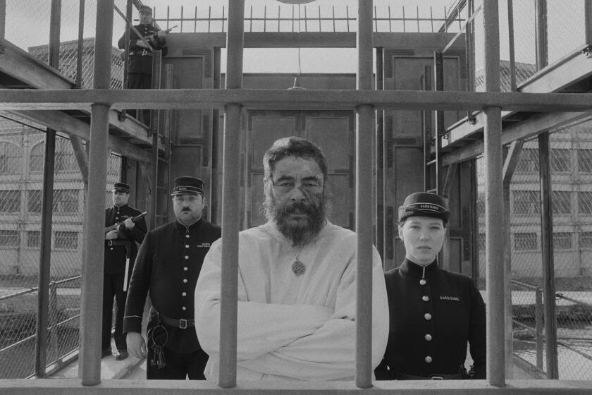
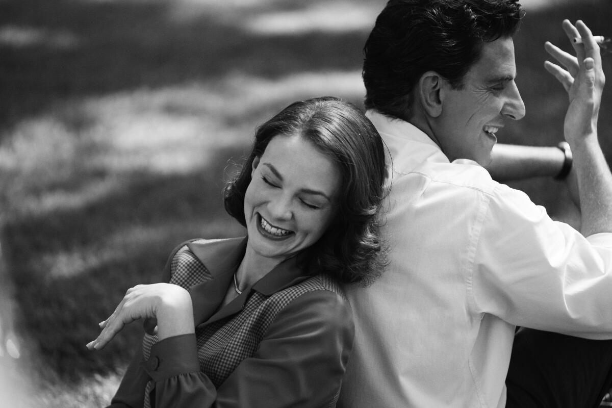
The black and white newsreel sequences don’t take up much of the movie, but they serve a very specific purpose. And Scorsese is far from the only director to make use of alternating black-and-white and color choices in his awards season film. No fewer than five contenders this year — including “The Color Purple” (Warner Bros.), “Maestro” (Netflix), “Oppenheimer” (Universal) and “Poor Things” (Searchlight) — make use of color switching. That decision by directors to employ black and white, amid sometimes eye-popping color, meant that their crews had to consider how much (and if at all) to adjust their sails to accommodate shifts in color perspective.
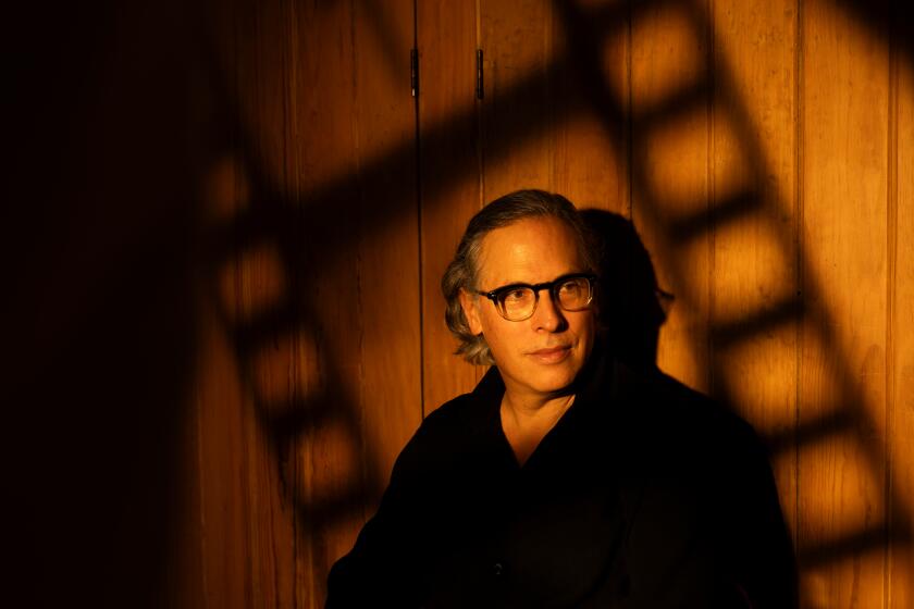
Mexico’s Rodrigo Prieto has developed close working relationships with Martin Scorsese, Greta Gerwig and Taylor Swift. And he’s directing his own movie as well.
As below-the-line departments know well, shooting in black and white is not the same thing as shooting in color, and there’s often a need for some translation. “We had a bright yellow 1947 Cadillac that worked well in black and white, but they couldn’t use it in color, because it stood out too much,” says “Maestro” production designer Kevin Thompson. “Certain colors get canceled out. You have to think about wallpapers, upholstery and drapery fabric. Those are the big things.”
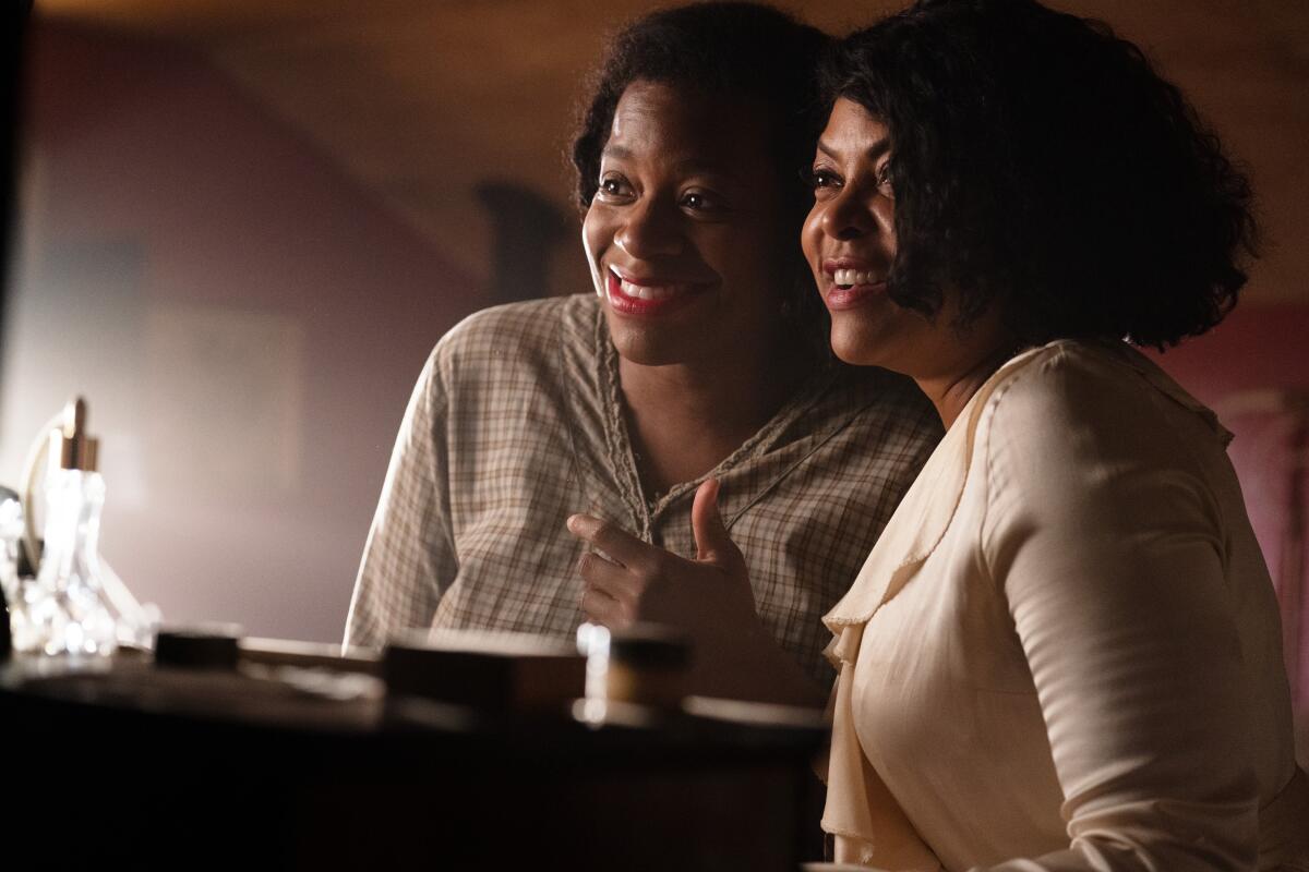
This can be a particular challenge when certain sets or costumes are seen in both color and black and white. “Not everything in color transfers well to black and white,” says “Color Purple” director Blitz Bazawule. “[Cinematographer] Dan Laustsen and I had to figure out how to make things stand out once they were in black and white. It’s not just like taking a color and desaturating it; [for a particular fantasy scene] the production design was done with black and white in mind.”
One major issue to take into consideration when a film is going to shoot at least partially in black and white is whether it will be filmed at all. Digital means that an entire movie can be shot in color and then color-adjusted in post — a choice that pleases cost-concerned studio execs. “You can do a lot in post,” says Laustsen. “Committing [to color or black and white in film] is more powerful — but there’s the studio, and a lot of people, who have to agree. It’s difficult to get monochromatic cameras approved, because if it doesn’t work, you have to reshoot.”
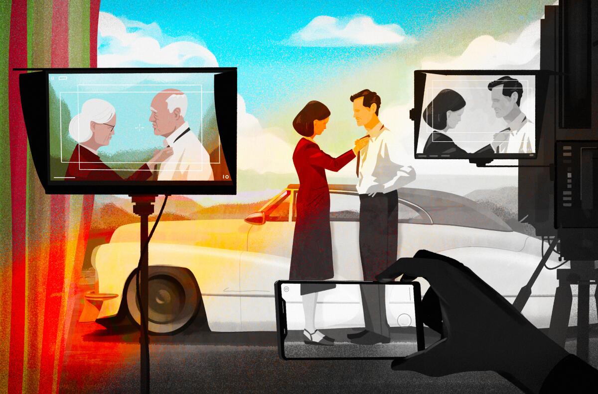
To avoid that problem, below-the-line crew members often have a tool on hand to make sure a particular scene would look right when shot in black and white — their cellphones.
‘Belfast,’ ‘C’mon C’mon,’ ‘Passing’ and ‘Tragedy of Macbeth’ all find advantages to going without color.
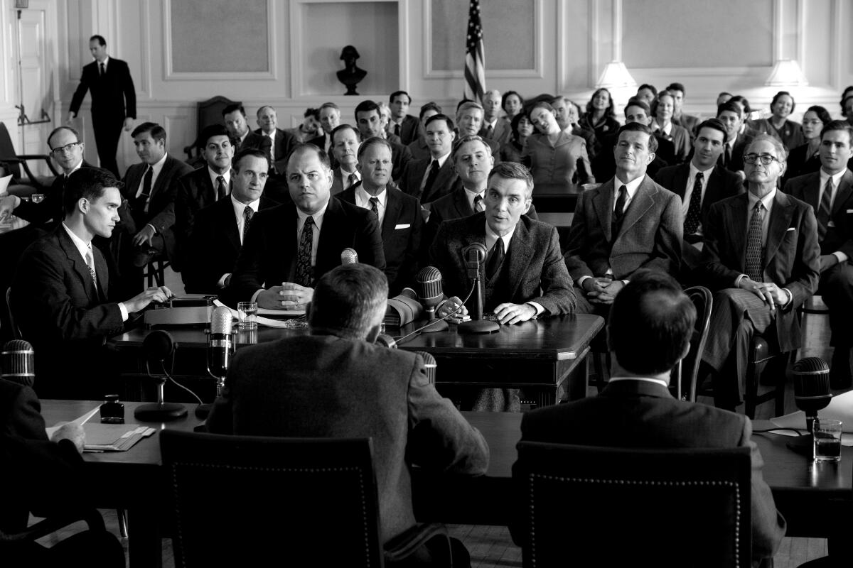
“When I considered what to use for the black and white sequences, I looked at different woolens and fabrics and textures, the quality of the gray scale, what will and won’t ‘bleed’ on camera — I just turned on my iPhone and used the black and white mode,” says “Oppenheimer” costume designer Ellen Mirojnick, who wanted to ensure that the stark white of handkerchiefs and shirts would stand out in the film’s non-color sequences. (Multiple crew members interviewed for this story mentioned their smartphone as a go-to tool.)
“Is it 100% accurate? No,” adds Mirojnick. “But it’s good enough that you can make the best decisions in the moment.”
Meanwhile, the decision to color switch isn’t always about flashbacks to the past. Bazawule used his fantasy sequence — in which Shug and Celie share an intimate dance — for emotional effect. “It’s stripping away any distractions in how the women felt,” says Bazawule. “Memory isn’t always in vivid color.”
Mirojnick also felt that black and white provided more than a way to show a time shift in “Oppenheimer.” “Sometimes in period films you, as the audience, witness what is going on in the frame as the story is unfolding,” she says. “In this case, the way the black and white was used, it was immersive. You were brought into each frame. Those selections had to organically feel like you were within [the scene] as opposed to just witnessing.”
That said, sometimes there just isn’t time to worry about whether a set or a costume or a lighting change is going to work in both black and white and color. Shona Heath and James Price, co-production designers on “Poor Things,” confirmed that swaths of the film would be shot in black and white just 10 days before filming began.
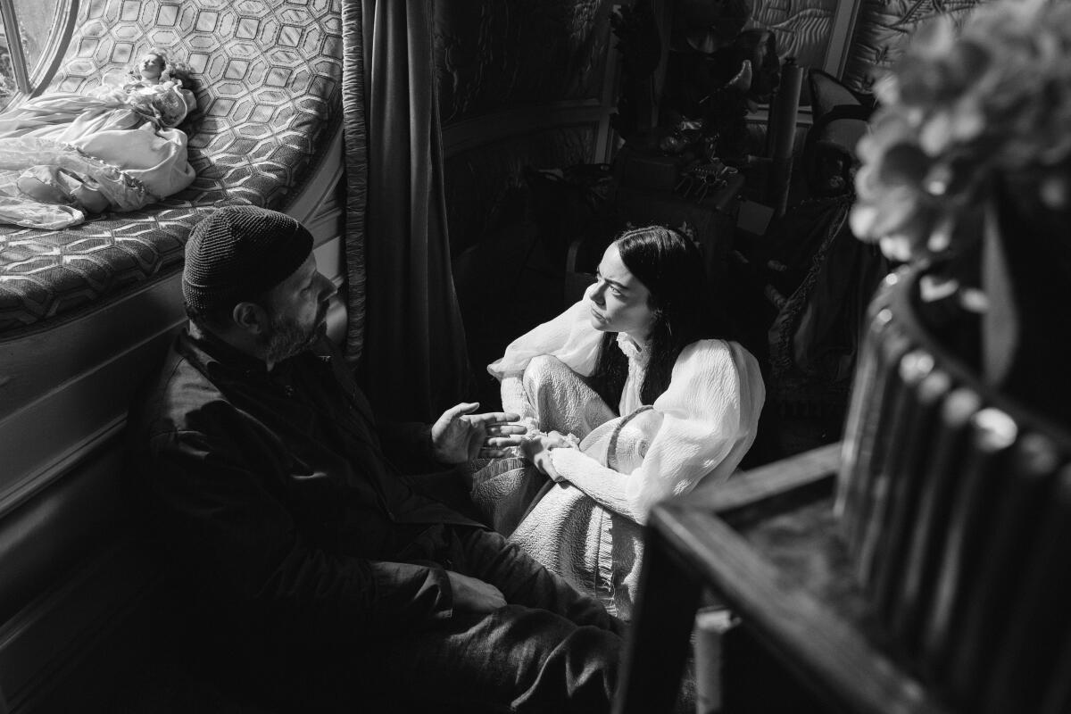
“Everything was built, colored and installed,” says Heath. “Yorgos [Lanthimos, director] probably knew earlier than he told us, because from the beginning, he told us to put as much deep, bold texture as possible. He didn’t want flat walls or sharp corners.”
Lanthimos may have committed to shooting everything on film but apparently still wanted to keep his options open. (All the concepting for the film’s chapter headings and opening title was done in black and white, though, Heath and Price say in a follow-up email.)
And in the end, Price says they wouldn’t have done anything differently if they’d known scenes would be shot in black and white.
But Heath has a different perspective: “In Bella’s bedroom there’s beautiful curtains — from mint green to pinky-red — and in black and white, they just look gray. I think I learned everything about the difference between black and white and color in those curtains.”
More to Read
Sign up for The Envelope
Get exclusive awards season news, in-depth interviews and columnist Glenn Whipp’s must-read analysis straight to your inbox.
You may occasionally receive promotional content from the Los Angeles Times.
